
Hey all,

I made a thing to save my eyes (and hopefully yours):

https://userstyles.org/styles/170527/jamf-pro-dark-mode
GitHub Source

Please read the installation notes carefully to activate the style.

Tested pretty extensively in Chrome; works in Firefox too. Unfortunately Safari is not possible at the moment until Stylish (or someone else) submits an app for Mojave / Safari 12. While Safari can load custom CSS via Preferences > Advanced, Jamf's CSS has some 'global' declarations in the first few lines for typefaces and I can't easily work around that AFAIK.

This is my first attempt to do anything remotely approaching 'front end web development' in over a decade. If I've missed anything obvious or made an amateurish / inefficient CSS gaffe, please let me know here and/or make code suggestions at my github repo.

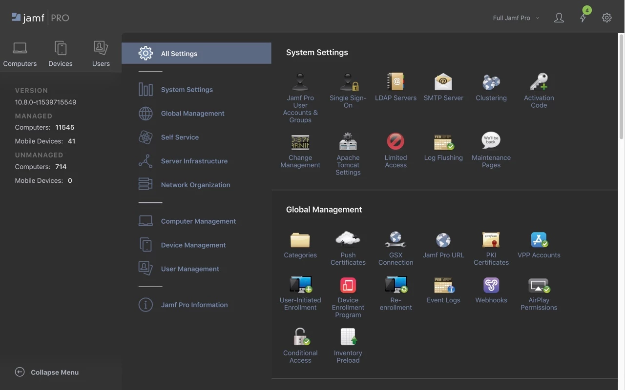
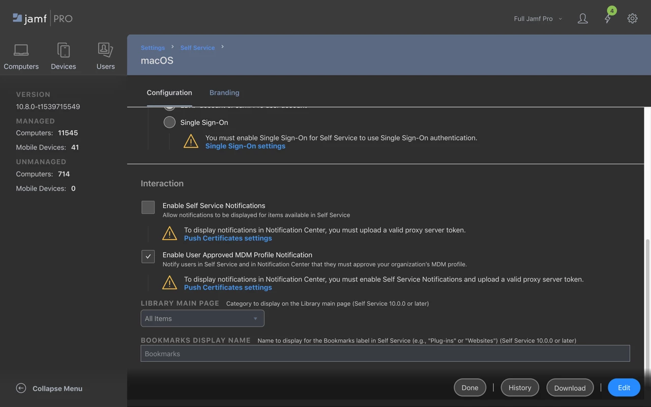
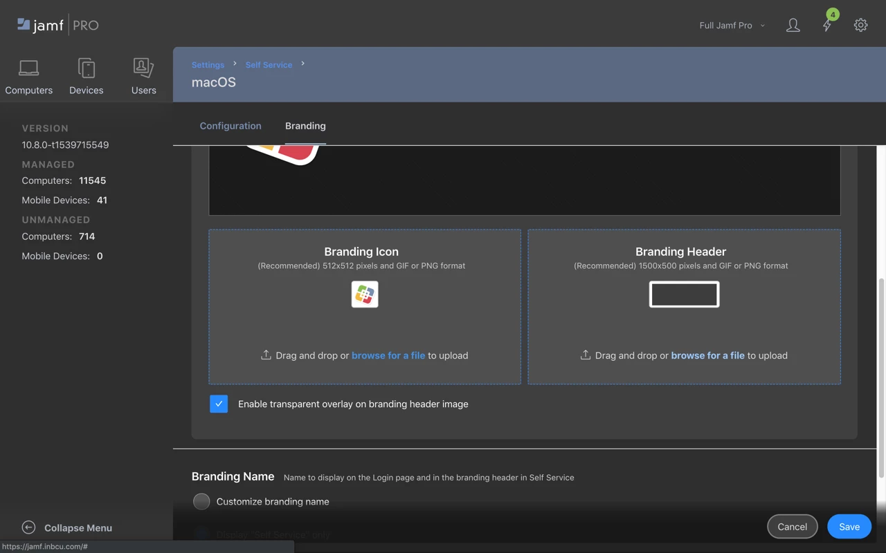
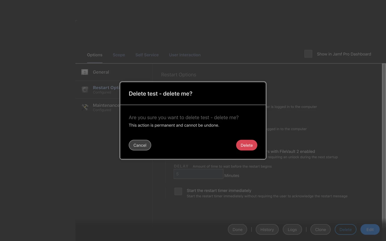
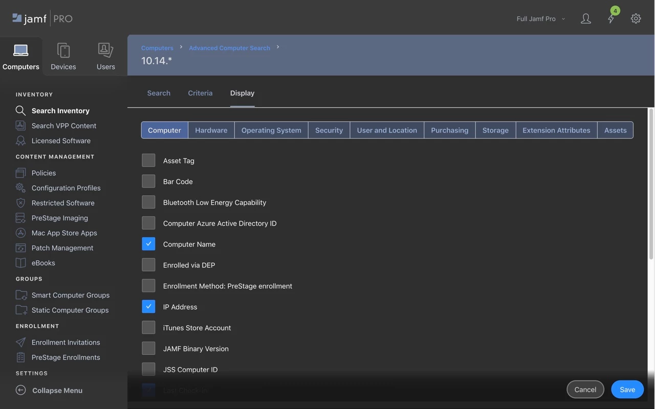
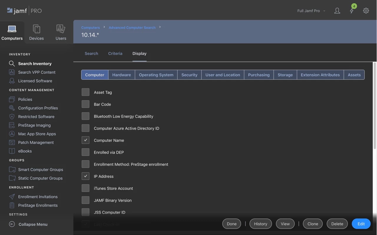
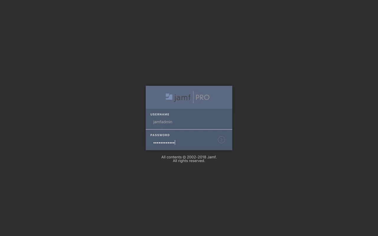
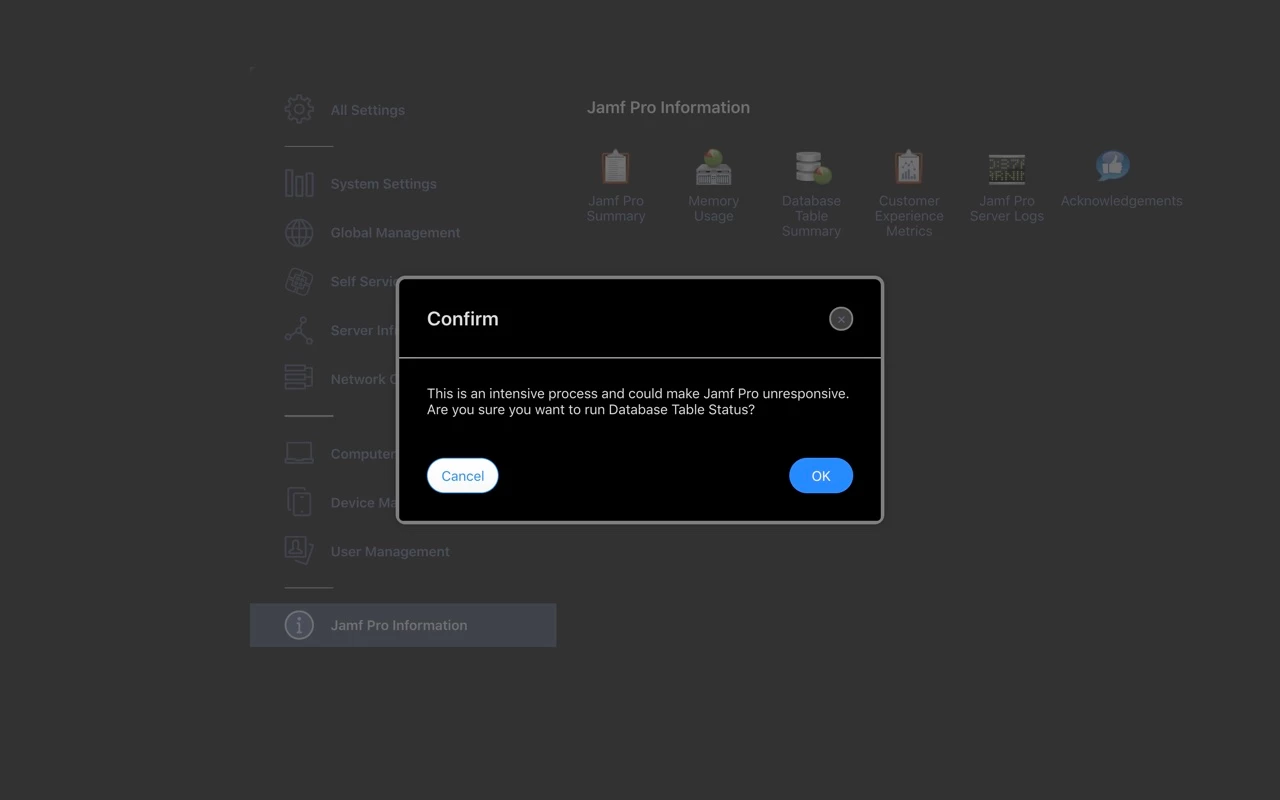
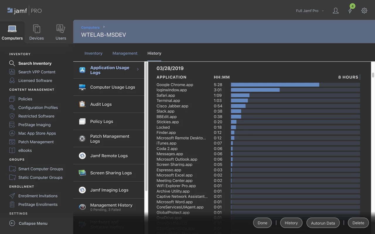
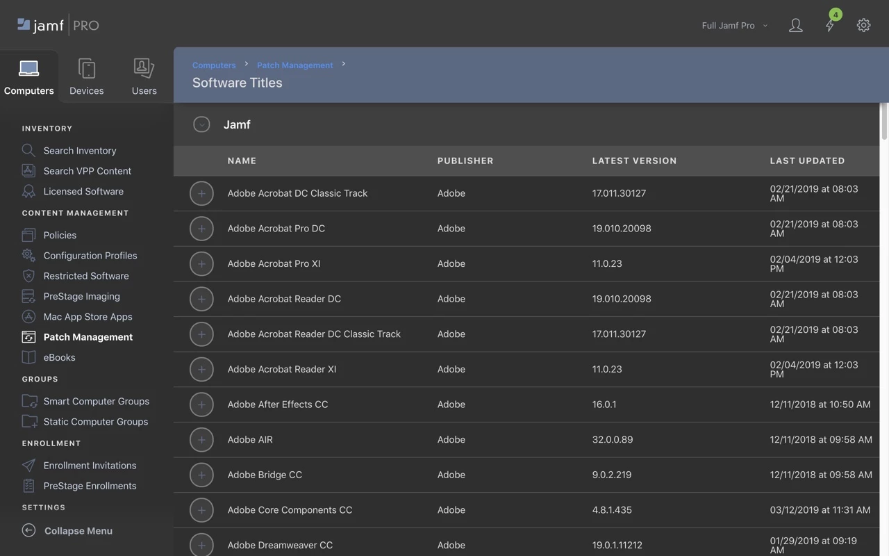
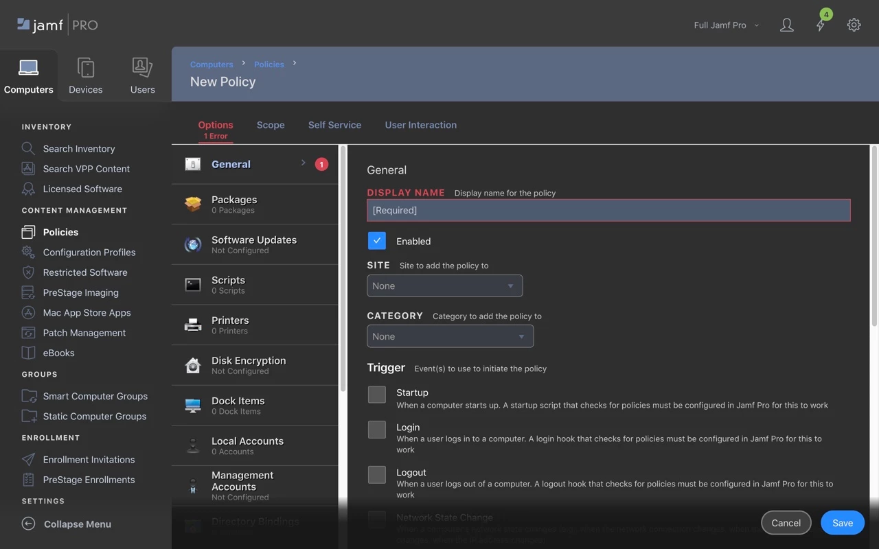
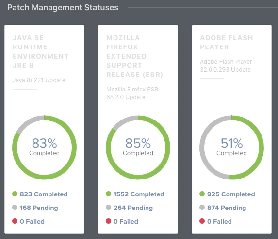
I've uploaded some screenshots here to whet your appetite.


@jsherwood : the reason for the inconsistency is that I had a background gradient to RGBA(24,24,24,0). I picked it arbitrarily as I was hacking away at this stylesheet. That turned out to be too dark to match #3f3f3f, it looked ugly on all the screens with buttons, so I raised the color to RGBA(47,47,47,0).

I've incorporated the dashboard adjustment into the style sheet on github and stylish. Confirmed it applied correctly by adding a patch management title to the dashboard.


Another update: if you ever receive an 'access denied' message, this calls the 'jamf-splash' page elements. I've fixed the colors and updated the style sheet everywhere.


@bradtchapman Found another one - the pop-up guides that appear when you click on the little 'i' bubbles (example: when creating a PPPC payload on Configuration Profiles there is one next to IDENTIFIER).

These are presenting as light grey text on a white background - will try and work on it tomorrow, looks like a div class "pendo-guide" (underscore either side, markdown is stripping them out!) along with some variations on the name are involved.


Today I updated the Dark Mode theme in two ways:

  • Reverted back to site default font choices. Although San Francisco font is superior to whatever Jamf is using, this global font change was affecting the Script pane by using proportional font instead of monospace. Reverting will fix this.

  • Fixed a pale blue hover color in the Patch Management section; the new color is dark blue, to ensure text is still readable when the mouse is hovering over that row. Should help other screens with similar table UI.

Please update your styles. Note: you will need to edit the domain in the Stylish control panel back to your Jamf Pro domain. The default is pretendco.


Is there a chance you could make this compatible with Cascadea so we can use it in Safari?
Thank you! :)


@bradtchapman That look awesome 👍🏻
I'll definitely pester every jammer I can to get this implemented.
It's really great!


@bradtchapman This style is great. One thing I have found is that on the dashboard Patch Management Statuses boxes are still white.


@adam.richardson : sorry but mine doesn’t look like that. Appears fine with a dark background. Are you sure you have the latest version of the theme? Maybe try removing and adding again.


@bradtchapman I do have the latest version, although I am using Edge browser. I was able to resolve the issue by adding the following to the code

.chart-widget
{
    background-color: #3f3f3f;
}

I'm definitely not a CSS expert, but it seems to have done the trick, thanks.


excellent work @bradtchapman . It works great on jamfcloud as well. A couple of the newer features in Settings don't display dark, Cloud Identity Providers and enrolment customisations but looks ok apart from that. Now if we could turn jamf | nation dark as well :-)


@marklamont - thanks. It seems Jamf is using YET ANOTHER NEW STYLE in these areas, instead of reusing existing ones. Our on-prem environment is on 10.15.1 so I won’t be able to check these new areas until I request a beta instance of 10.18.


I've just updated my Jamf Pro Dark Mode CSS style sheet to deal with some subtle changes with Jamf Pro 10.19. Github source.


Hello, Any updates to this in 2022? Smart Group lists are completely white? Wondering if anyone has updated the CSS?


Looks like with the new version of Jamfpro we have a style-breaking new user interface. Jamf Pro 11.0.1


I would also like to note that if you use Chrome, you can do the Chrome://flags -> Auto Dark Mode for Web Contents
-> Enabled with selective image-based inversion on transparency and number of colors

 
This might not be a palatable solution since it forces ALL websites into a similar darkness which, for some sites, can be wildly off-putting and its not nearly as pleasant as the OP's jamf pro skin, but it works as a stopgap for us who cannot abide bright white screens in the morning. 

Hello all,

Thank you so much for giving this style sheet so much love over the years.  Since Jamf has announced a plan to implement a native dark mode in Jamf Pro 11, I will be retiring this soon.  

My recommendation for you all is to use a browser extension like Dark Reader for Chrome or Safari.  It has many more options that my style sheet ever could.  

Stay tuned, as Dark Mode is coming SOON™ to a new version of Jamf.