
Hi,
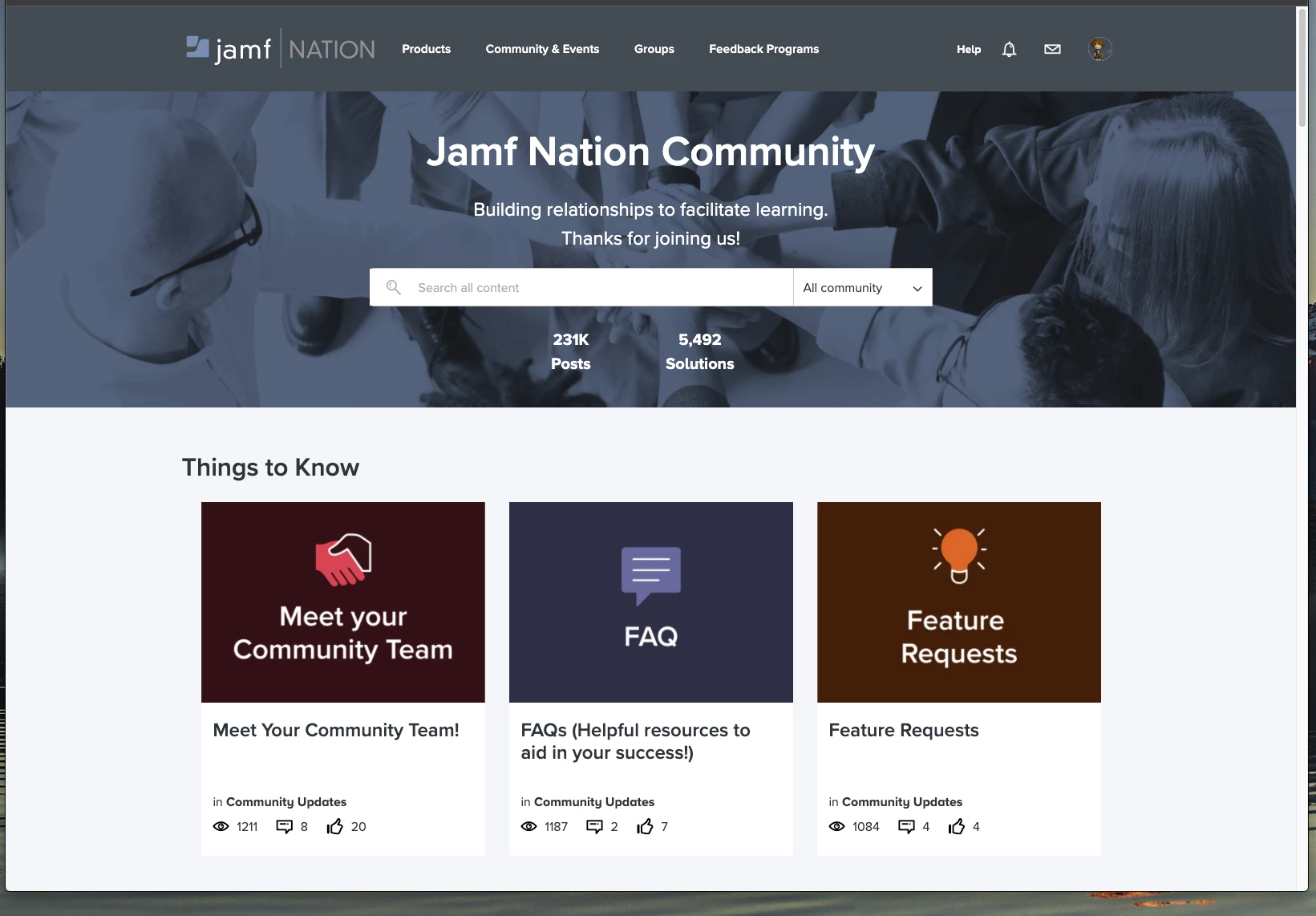
So, first things first, I thoroughly enjoy the new Jamf Nation site. I'm more used to this kind of forum threads from others I visit, and I always thing updating and modernizing is great. My one gripe with it really is the main page. The top banner, the search space, and the top "Things To Know" topic links are HUGE. If I have to scroll every single time I open the page just to make it usable, that seems like a small design flaw. And i'm not zoomed in, i'm on an ultra wide display with fairly high resolution, and I still have to scroll down just to see the first post. Maybe bring in the white space a little, or shrink the size of the top banner.
Image attached so others can see what i'm seeing, maybe i've doing something wrong.
Thank you,
Dan