Question

Self Service UI elements

  • January 30, 2017
  • 7 replies
  • 17 views

Forum|alt.badge.img+11

Hi All!

This is really about usability than an actual bug. Is anyone else seeing UI elements that are overlaid or inaccessible to users in SS like the one in this screenshot?

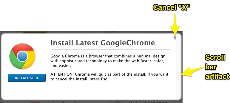
If you have, is there a way to make that better?

7 replies

mm2270
Forum|alt.badge.img+24
  • Legendary Contributor
  • January 30, 2017

Yeah, its been an issue with Self Service for a while now. Pretty sure there is an existing Feature Request out there asking to fix this issue, among others. If I can locate it, I'll post it here so you can go add your vote to it.


Forum|alt.badge.img+13
  • Honored Contributor
  • January 30, 2017

Did you resize your Self Service icons?


mm2270
Forum|alt.badge.img+24
  • Legendary Contributor
  • January 30, 2017

Nah, has nothing to do with the size of the icons. When you click on any Self Service item to bring up the description window, the close button is partially obscured by the scroll bar that shows up on the far right side. If your OS settings are at the default and the scroll bars disappear when no mouse activity is present, it goes away and the close button is fully visible, until you move your arrow pointer again. Its been this way for a while now.

As I said, I'm almost certain there is/was a Feature Request asking Jamf to fix this (or it was mentioned in the threads of another FR), but I haven't been able to locate it. The search system is failing me at the moment.


Forum|alt.badge.img+9
  • Contributor
  • January 30, 2017

Yes it's been a pain for some time..

Jamf should make the effort to get it fixed..

I know this bug was in Vn 9.92 and it's still in Vn 9.96


mm2270
Forum|alt.badge.img+24
  • Legendary Contributor
  • January 30, 2017

It goes back much further. We're still on the now crusty version 9.82 and its present there. I'm very certain it was present in the earlier version 9 releases as well. As said, its an old issue and Jamf really should fix this, since I'm guessing this is just a css/rendering problem that could get knocked out fairly easy, if they would assign some people to it.


Forum|alt.badge.img+16
  • Valued Contributor
  • January 30, 2017

It's a function of having enough text that a scroll bar is required, very short descriptions don't, or at least didn't do it.
But @mm2270 is right, been around for quite some time now and pretty ugly really.


Forum|alt.badge.img+11
  • Author
  • Contributor
  • January 30, 2017

Thanks for the info. I've been playing with the amount of text and other elements to try to get it to behave. good to know that the "...press Esc." is the way to go for now. I'll ping our JB and see if he can help find the FR

--MP