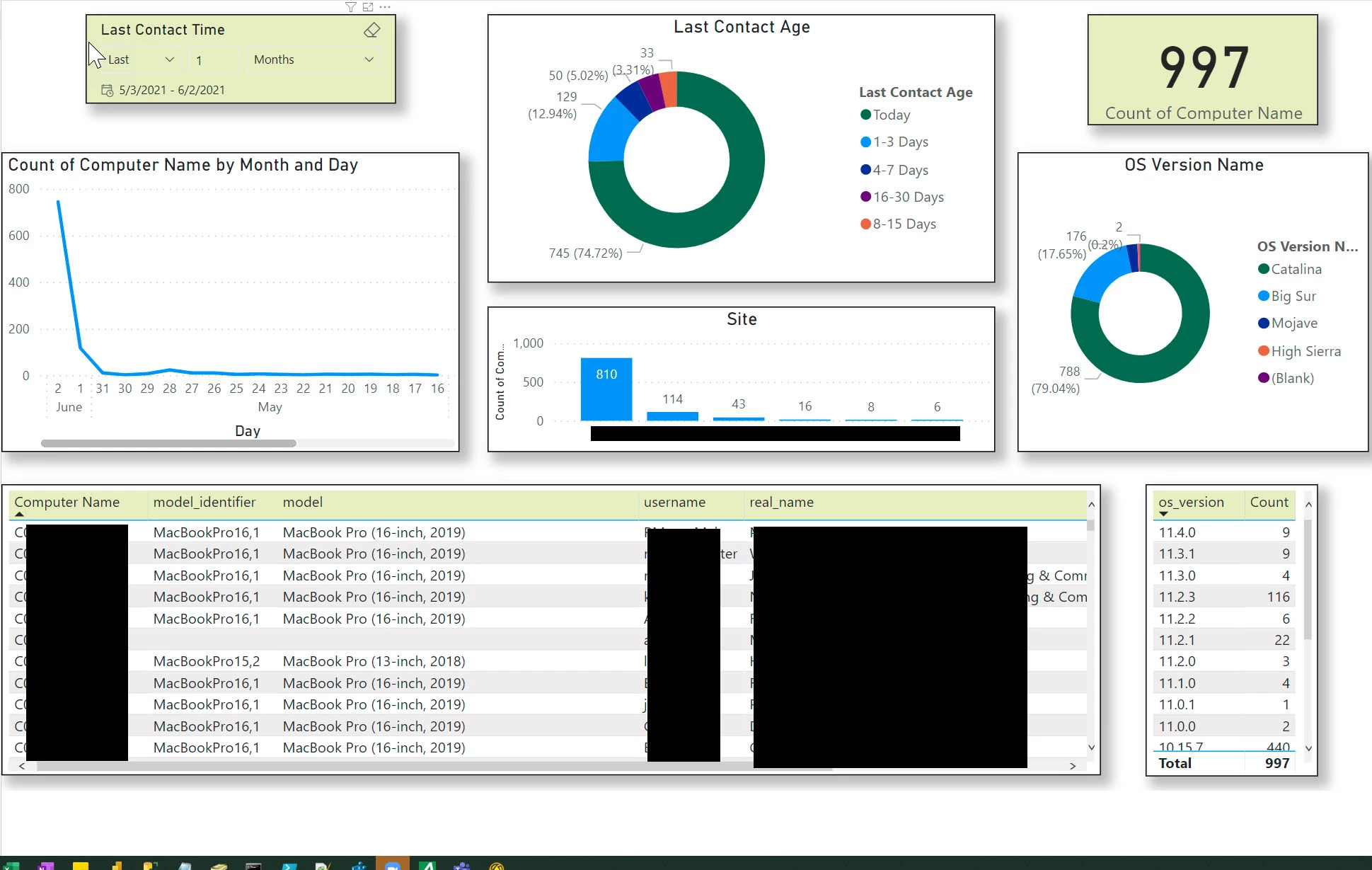
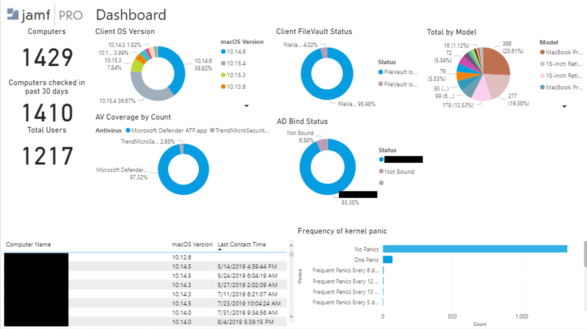
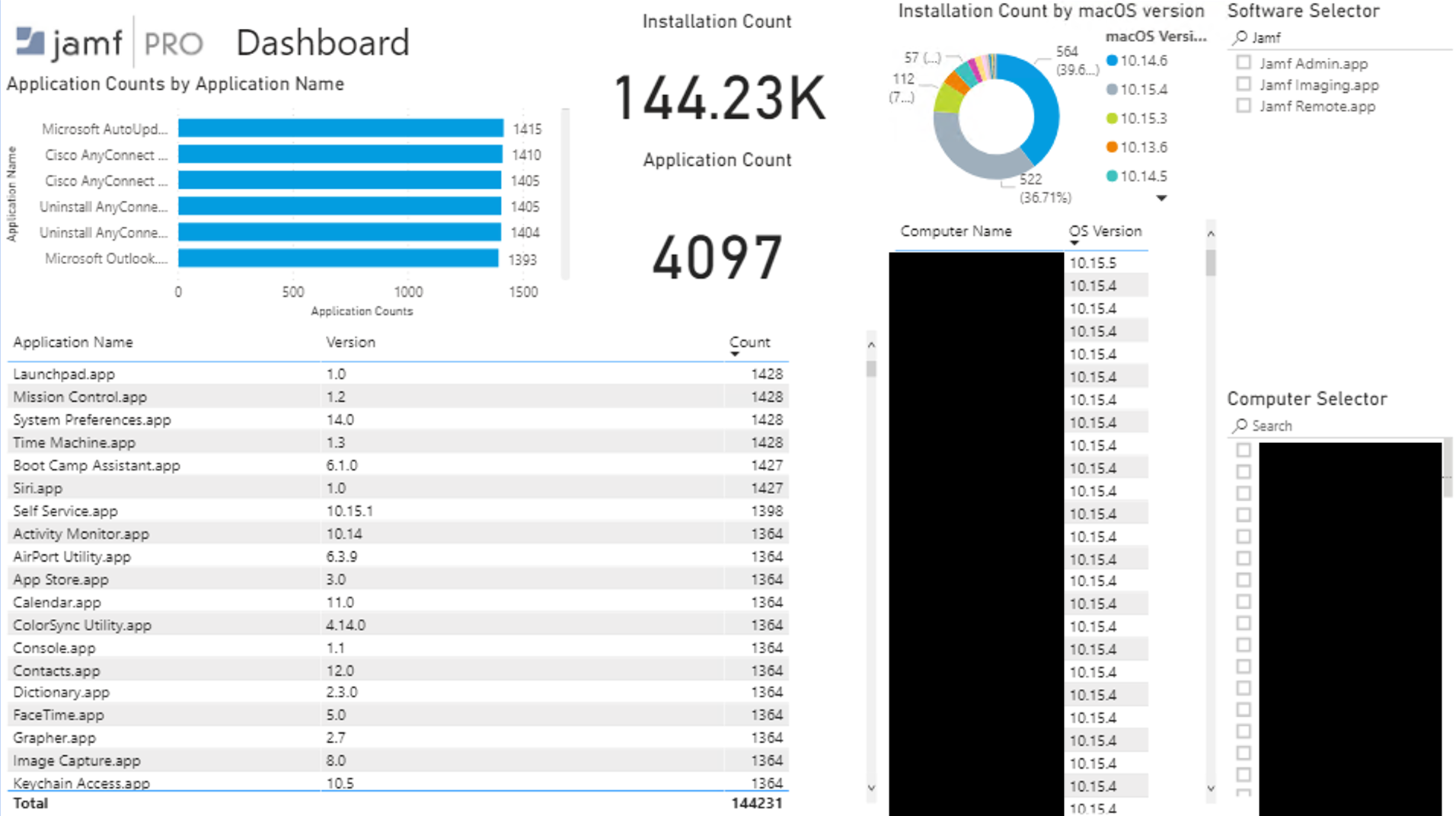
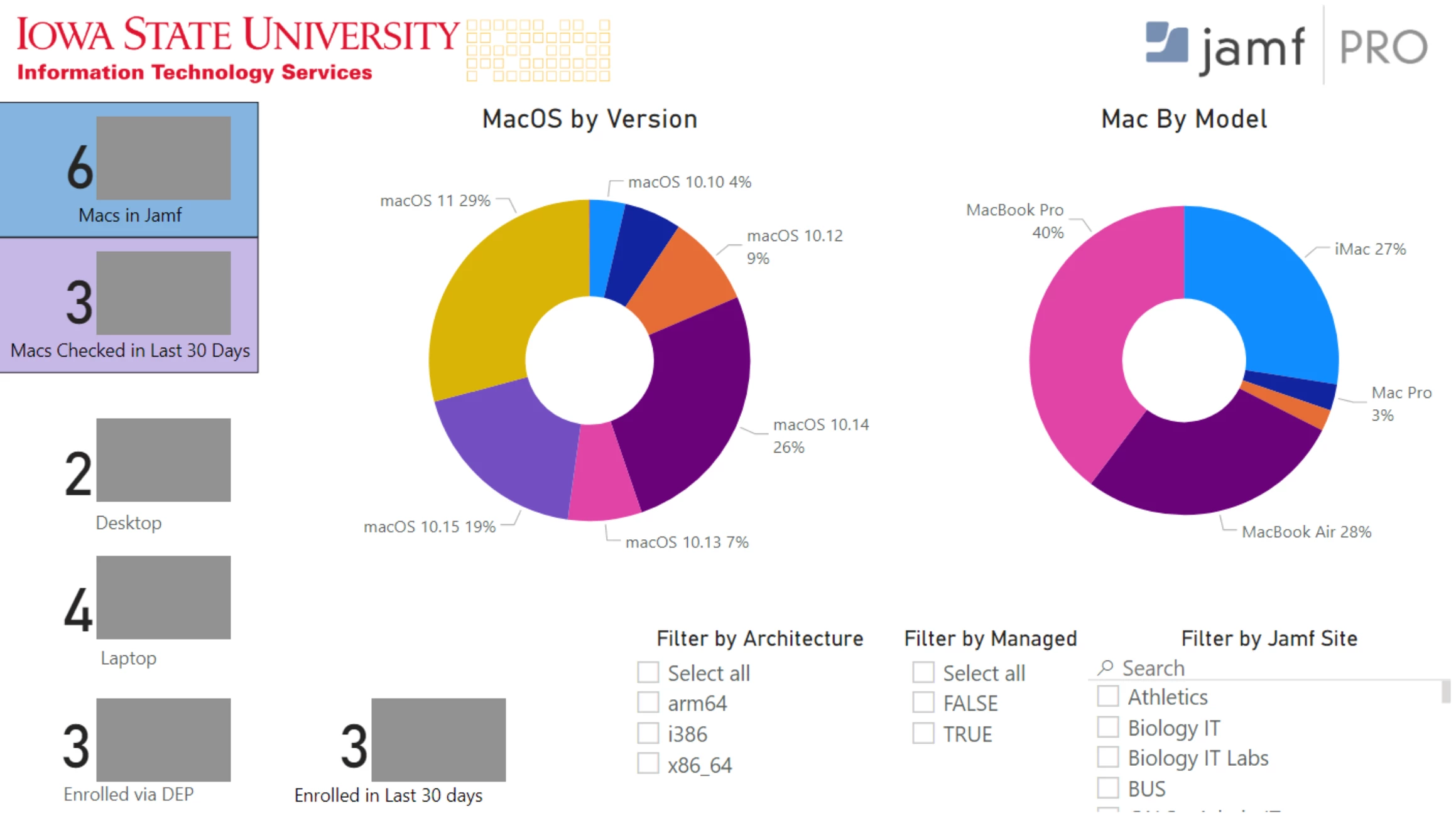
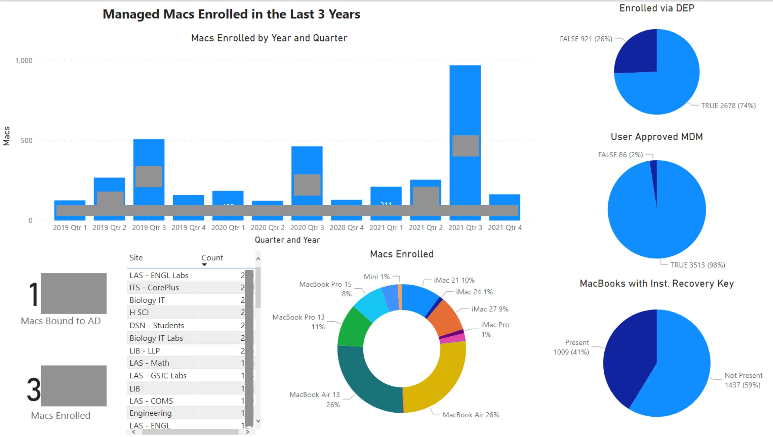
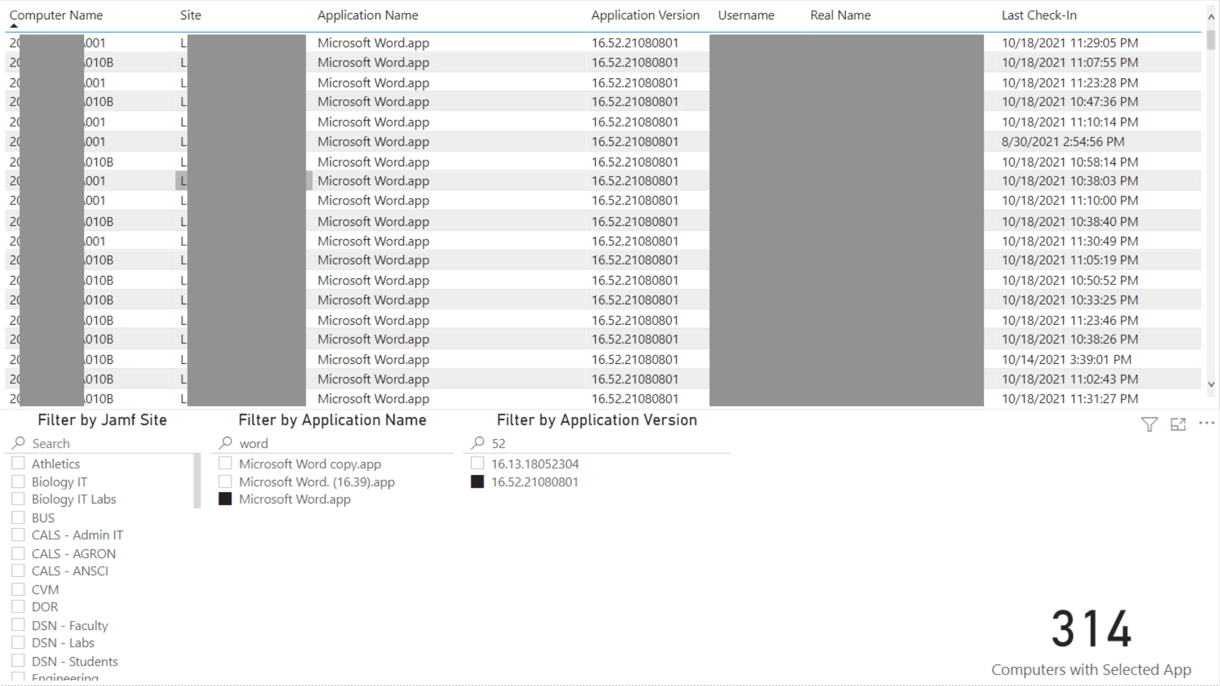
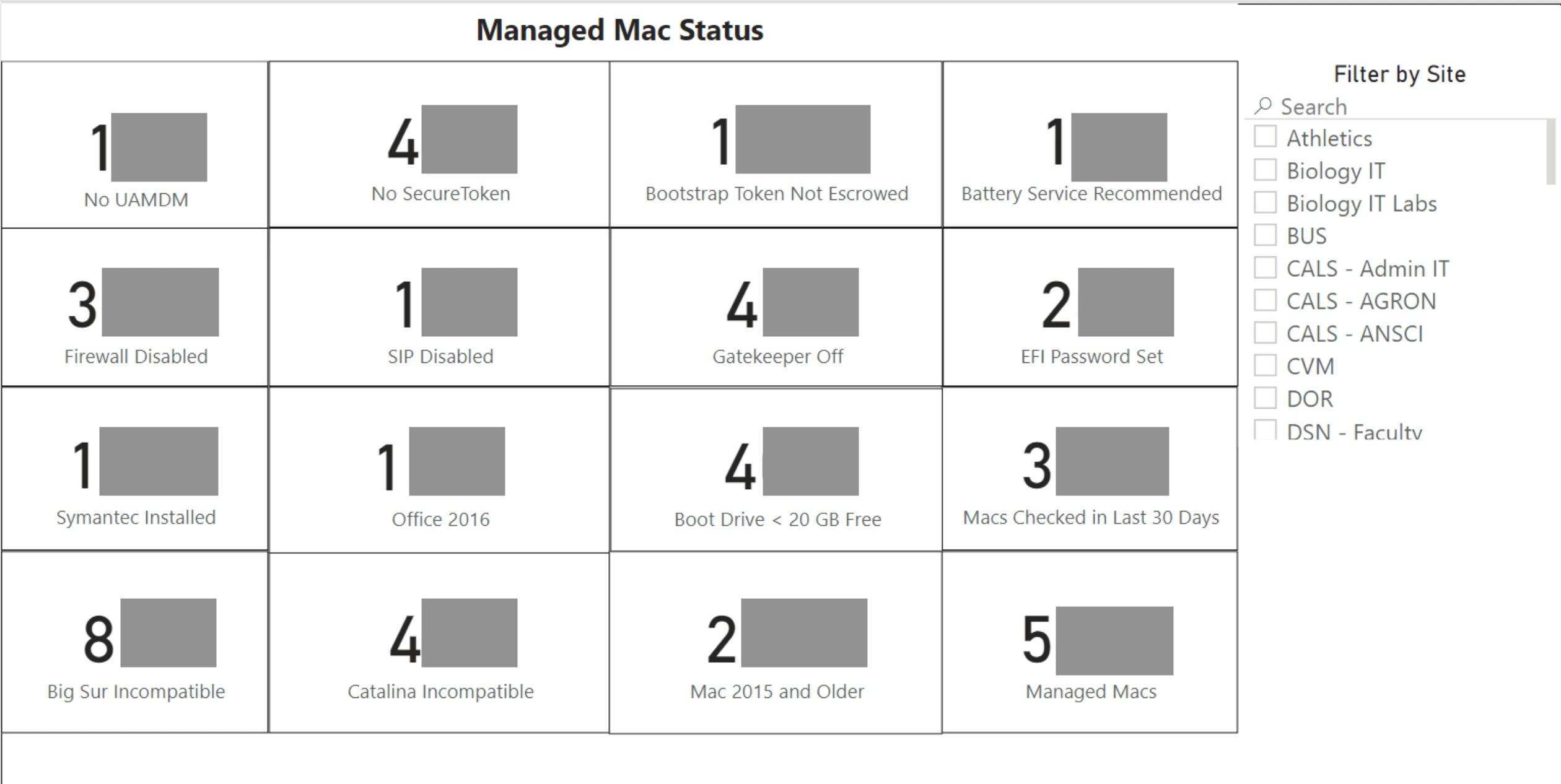
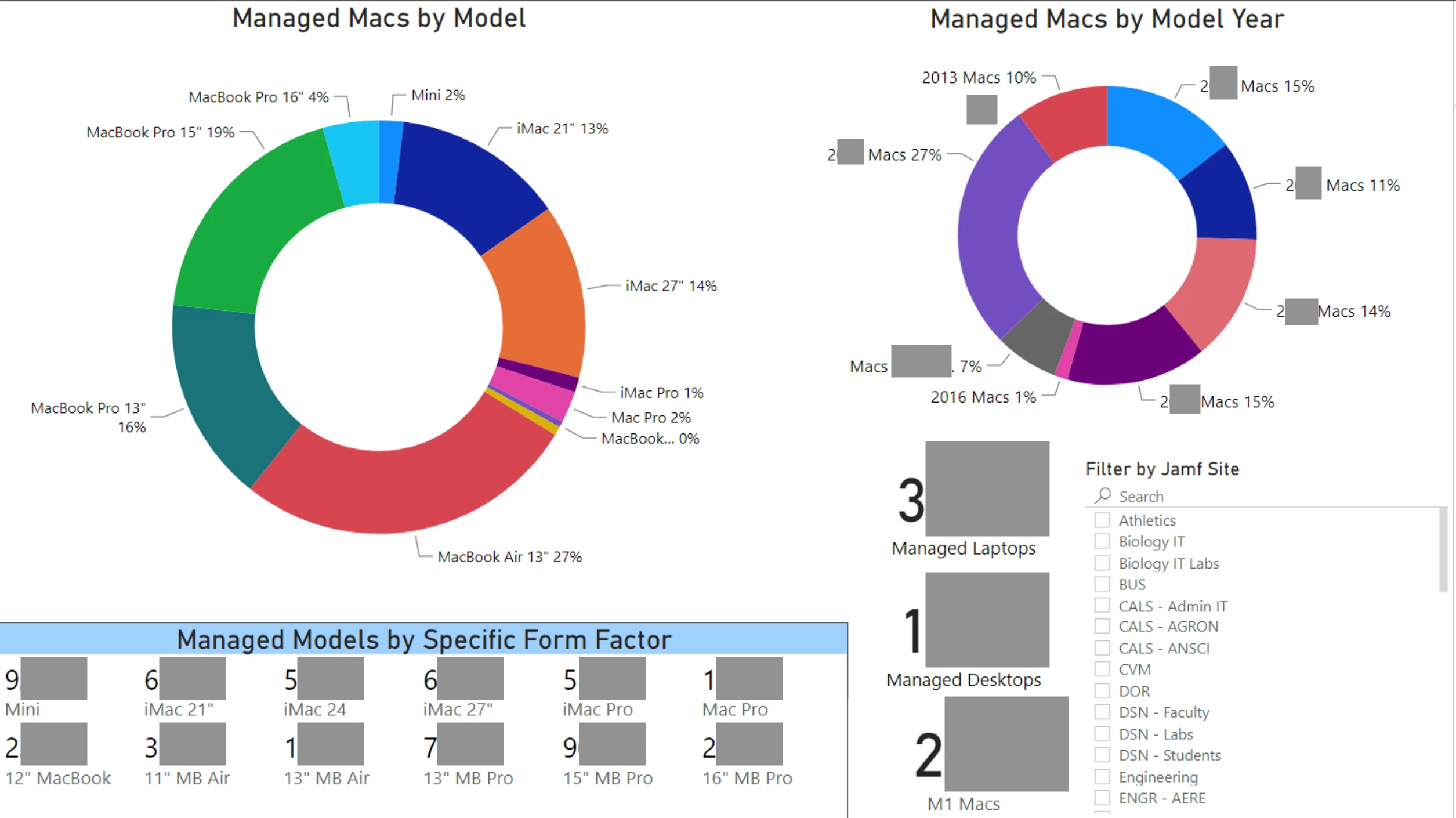
Right on, thanks for joining @evaldes and we're excited to see what you come up with!
We are currently looking into Splunk and seen how we might can use it.
We made a API check against /JSSResources/computers as in there learning videos.
I have seen @DBrowning did a lookup against group memberships. I wonder how/if this is working for the API lookup they do as well or is is more wise to create a new Source that uses a Search with the fields displaying we want?
Thanks
There's a more verbose version of Jamf's Splunk Integration Guide available on Github. It goes into things like integrating data from multiple sources and more step by step on building searches than we wanted in the product documentation. And lots more screen-shots. :)
There are also some scripts there to pull things like mdm command history and application usage data that need some transformations that we haven't yet built into the standard plugin, and complete dashboards you can download as source code that you can just copy-paste into your Splunk. We'd love to see others share their dashboard code as well.
For those using PowerBI, this non-Jamf Blog is very helpful.
With Power Bi, has anyone found a way of filtering the results of last check in date so that it just highlights everything that hasn't checked in in greater than a certain period of time, such as hasn't checked in for more than 2 weeks?
Hi,
Just started getting a Power BI dashboard together and its going pretty well.
Just wondered if anyone can help with one dashboard we really want to view.
I have 2 smart groups, one to show devices in the office and one to show devices out of office (WFH).
I want this to tick along daily/monthly showing a nice line graph of the change in numbers each day. So along the bottom of the graph would be the date and then device count up the side.
I cant for the life of me find a date field so this is impossible without it?!?! Any ideas?
@AndrewShooter , you could set a "Active" column where it is True/False and then have where you have a slicer with the Active values and when someone interacts with it you can change the interaction from Filter to Highlight(I think that's the name) and it should highlight the items instead on that specific visual.
@perryd84 are you referring to the Check-In, or looking for the actual number of devices? If the latter, than you might want to run a scheduled task that updates either a CSV or another storage method where Power BI could pull the data from.
Thanks @cybertunnel I'm now pulling the info from the JAMF API to a csv which is stored in sharepoint which is attached to power BI. Working a treat! Thanks for the tip!!
Those who use Splunk for reporting, what is it that you gain that can't be accessed on the Jamf interface?
Tangentism, please see this doc and Lisa/Kevin's JNUC 2020 Splunk presentation for some examples. There are some example dashboards in the same repo as the pdf doc. If you scroll up in this thread there are some super slick d-boards from DBrowning and LisaCherie. But you might go at this from a different angle... think about what issues your device management program is being asked to address and how data and visualizations might be used to provide meaningful insights or active monitoring. Then go from there.
For those using Splunk, are you using the free version (with the 500MB limit) or a paid tier? Thanks!
I wonder if @DBrowning might be able to help.
I would be interested to know how to get the percentage for example for OS versions like 10.14 into my Dashboard?
I had been able to get the numbers out of a query but would like to understand how I can add the percentage.
@maik.sanftenberg Here is the code that I'm using in one of my examples above.
<panel>
<title>Clients on 10.15 (Catalina)</title>
<single>
<title>Total</title>
<search>
<done>
<set token="tokCatalinaCount">$result.sum(count)$</set>
</done>
<query>index=cai_app sourcetype=JamfModularInput computer.Computer_Group.Computer_Group_Membership.Group="Macs on 10.15" | rare limit=20000 computer.name | stats sum(count)</query>
<earliest>-60m@m</earliest>
<latest>now</latest>
<sampleRatio>1</sampleRatio>
<refresh>60m</refresh>
<refreshType>delay</refreshType>
</search>
<option name="colorMode">block</option>
<option name="drilldown">none</option>
<option name="height">178</option>
<option name="rangeColors">["0x006d9c","0x006d9c","0x006d9c","0x006d9c","0x53a051"]</option>
<option name="rangeValues">[0,750,1500,2250]</option>
<option name="refresh.display">progressbar</option>
<option name="underLabel">Clients on 10.15 Catalina</option>
<option name="useColors">1</option>
<option name="useThousandSeparators">0</option>
</single>
<single>
<title>Percentage</title>
<search>
<query>| makeresults | eval Total=$tokTotalCount$, Catalina=$tokCatalinaCount$ | eval percent=round((Catalina/Total)*100,2) | table percent</query>
<earliest>-60m@m</earliest>
<latest>now</latest>
<sampleRatio>1</sampleRatio>
<refresh>60m</refresh>
<refreshType>delay</refreshType>
</search>
<option name="colorMode">none</option>
<option name="drilldown">none</option>
<option name="height">171</option>
<option name="numberPrecision">0.00</option>
<option name="rangeColors">["0x006d9c","0x006d9c","0x006d9c","0x006d9c","0x53a051"]</option>
<option name="rangeValues">[0,25,50,75]</option>
<option name="refresh.display">progressbar</option>
<option name="unit">%</option>
<option name="useColors">1</option>
<option name="useThousandSeparators">0</option>
</single>
</panel>
We looked into Spelunk but couldn't get the cost approved (being a school district), so I decided to make my own Apple TV app that does a more basic data pull


@bejohnson Hi, can you share you Dashboard as a Template?
@jphillips do you have a copy of the app that we can use and modify for our needs? We too are a school district with limited budgets, but none of us really have any experience making Apple TV apps.
{/quote}
Does anyone have any examples they could share showing changes over time? I've been asked to deliver reporting on traditional 'patch Tuesday' type uptake, ie how many users have run a patching script over a period of time, or how many devices are not on their current OS build. Thanks!
We recently started to pull logs from Jamf Pro using API as per Slunk App add-on, but those logs are just one huge mess.
For example extension_attributes have arbitrary field names are not constant:
computer.extension_attribute.extension_attribute.extension_attribute.extension_attribute.multi_value
and
computer.extension_attributes.extension_attribute.extension_attribute.extension_attribute.extension_attribute.extension_attribute.extension_attribute.multi_value
Some fields names have over 20 repeated "extension_attribute". This applies to all the field names and they have varied length of repeated nested object names.
On top of this many of the entries are multivalue which means you have to mvzip and then expand them in order to do any meaningful stats on them.
Then there seem to be quite a few truncated entries that are missing end tags like:
Normal one:
<extension_attribute>
<id>22</id>
<name>Cososys Launch Daemon Loaded</name>
<type>String</type>
<multi_value>false</multi_value>
<value>Yes</value>
</extension_attribute>
Missing tags:
<extension_attribute>
<id>126</id>
<name>Installation Date
</extension_attribute>
So my question is what are we doing incorrectly as I don't see many people mentioning these issues and they have dashboard panels showing data which is literally impossible with the current data we have in splunk coming through via API.
Any help would be much appreciated.
These are some great dashboard ideas shared. Here is one I have created and we are using using Power BI.

Can you Share it as Template? @wdrain01
Here is one that I have been working on that is still growing. I'm using PowerBI for the reports using the published Jamf Pro PowerBI connector.


Is this available as a template?
I did a talk today at JNUC 2021 on building dashboards in Power BI. Thanks to you all for sharing your dashboards and giving me inspiration on how to start on mine. I've got my slides out on https://github.com/technotica/PowerBI for anyone that wants to take a look at how I made them and tips and tricks on using Power BI with the Jamf Pro connector.
I haven't found a way to export a template (.pbit) of my dashboards for mass consumption. The main issues are that when I make a .pbit file it wants to retain my Jamf server information and it also retains queries specific to my Jamf environment, namely Extension Attributes. Manually editing the pbit file is possible to share would be possible, but would require the person using it to do some manual editing too. It is all pretty sketchy.


Hey great talk and great sildes. I'm currently trying to recreate your dashboard but failing with the enrolled in 30 Day and Checkin in 30Days Elements? Do you have a tip for the measures?
Best Regards
Colorenz
Hey great talk and great sildes. I'm currently trying to recreate your dashboard but failing with the enrolled in 30 Day and Checkin in 30Days Elements? Do you have a tip for the measures?
Best Regards
Colorenz
You don't need a measure to do this, what seems intimidating at first glance actually isn't too bad to implement
. It does require that you have your dates properly formatted, so take a look at my talk or slides on how to do that.
- Search for 'id' in the Fields category.
- Under Computers query, click and drag the id to the visualization page.
- Under the Visualizations column, click on the drop arrow for id and select Count
- Change the visualization to Card
- This will give you the entire count of Macs in your Jamf Pro environment.
- Search for 'last' in the Fields category
- Click and drag the computerDetails.last_contact_time into the Filters pane on top of the 'Add Data Fields Here'
- Change the filter type from Basic Filtering to Relative Date.
- Set the 'is in the last' to however many days you want.
- Click Apply filter.
Now this card will be filtered on the relative date. Keep in mind if your data hasn't been refreshed in a while this number will not be accurate.


Oh that was to simple for me😂. Thank you...
Have you found a way to activate the autoupdate for the reports on the web?
