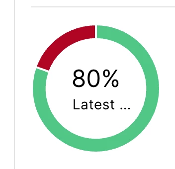
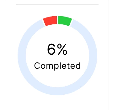
With the rollout of Jamf Pro 11, my cloud tenant updated without issue. However after using the new updates for a few days, I'm becoming slightly annoyed by the change in color palettes. Policy status (the 6% below) are brighter color palettes. The Patch Management Statuses colors are what appear to be the pre-Jamf Pro 11 color palette. It's semantics, I know, but when my dashboard is full of policies and Statuses that I use for at-a-glance updates, it's very noticeable. I know this isn't where you post feedback, but I know Jamf watches the forums.


