I just upgraded to 10.2.1 and I'm drawing a blank for how I can brand our Self Service. I've sent the technical specifications of the icon and banner size to one of our graphic designers but without some samples of what is out there, we're kinda fumbling.
I've had a couple ideas for just boring company logo over a photo of our building. Blah. I've had another idea for a banner image that I can change out with static alerts like holiday hours, company events, special software updates that need users' attention. But I don't know how they would look with the Self Service window at different sizes. Unfortunately JamfPro doesn't give us a sandbox to play around in to preview things. (I'm struggling to get a test server working at the moment)
I know that the text overlay is white so our images have to have proper contrast for it to be seen, but I'd like to see some real-world examples. Let us see what you've got! :-)
what is the size of the banner for the Branding Header"use a GIF or PNG file that is 1500x500 pixels." but my image looks terrible.
This will be known as the Self Service dark times... where nobody wants to show off their branding now its all changed for the worse with 10.27
This is exactly why you don't test in production...
At the moment, as long as Self Service still works, I'm not too bent out of shape over the re-design. I don't quite see the advantage of it over the legacy version, since most of the main content (aka buttons to click) still look the same. Just that a) the header image doesn't fit, and b) the sidebar looks more "Finder" than it did before. Sure. Ok.
There was a time in the early/mid 2010's where Jamf kept putting out upgrades that just. did. not. work. At least we aren't having that problem with self service.
I have a series of photographs that I prep for this, as well as the desktop backgrounds for people to choose.

With 10.27 the branding image doesn't 'resize' like I'd expect. instead it gets all distorted. :(
Also, I've lost my categories on the side! GAH!!!
No matter how much resizing I've applied to the original image in Preview I can't seem to get our banner to look presentable in Self Service 10.27. Sad to say we've simply removed our banner for now... See ya later, Zenyatta :(
Pre-10.27 and with 10.27. Major issues with the space allocated for Company name (which violates our branding standards), banner image re-sizing, etc.
Oh and Categories... Not there... Unless I click in the blank space located between the Search field and the Notification, at which point a Browse pull down appears with the categories.
So yeah, lots of stuff to not like.


https://www.jamf.com/jamf-nation/feature-requests/10177/revert-self-service-s-design-to-the-10-26-version
Please vote!
It has totally messed up the branding and it looks terrible now.
I adapted to the new format by replacing our branding header image with one that emphasizes text, rather than a photo. That way it works at any level of stretching. I also tightened the kerning by 25% on the text of my base image, to make it look better on our widescreen monitors.
This change was brought to my attention by a user, which is embarrassing. Especially when you're a creative company full of people that scrutinize these things.
It does seem odd that Jamf is a company focused on Apple products but seems to be incapable of following Apple's UI design guidelines. Nothing looks or acts very Apple-like, so I'm not surprised by this, but I wish I didn't have to do damage control.
I can't imagine who at Jamf thought this was a good change. If people go to this much trouble to make Self Service look good, Jamf should not be undoing all their hard work.
Old vs new... Thank you JAMF for helping our department garner respect through design. #blatantsarcasm


As of Jamf 10.27 the recommended header size is now 335 x 1000.
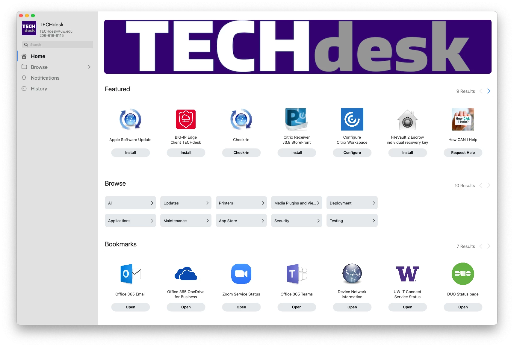
Here is our's, i had to change the pixel size to get it to size right. It wouldn't look right with 1000x335. Had a designer here at VW help me get something dialed in right. I'm happy how it came out.

Last year I felt bad/lazy for not having a banner and just using our university logo/name, but now I feel like I dodged a bullet. What I was considering picking would not have looked good by itself in the redesigned Self Service.
Here is ours, this go around of Self Service Branding;
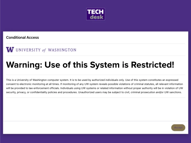
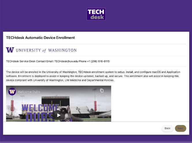
I also added Prestage enrollment customization.


How did you get the image to go all the way across?
Jamf's branding page gives a recommended resolution. You just need to either find or crop a selected image to meet that.
Branding Header
Image to display across the top of Self Service. This will not display in the branding preview.
Recommended 1500x320 pixels and PNG or GIF format
The greatest shame is that one cannot use animated gifs for the banner!!!!!