

Comic Sans is just my type.
Not really.
You’ve got a story! You know what you want to say. How do you say it?
Your presentation deck is how you turn your ideas into something visual for your audience. It’s going to complement what you’re there to say. You as the speaker are not there to complement your presentation deck.
com·ple·ment | kämpləmənt | verb to complete or bring to perfection
In other words, what you say is more important than what you show, but what you show can help you with what you’re saying.
Apple Keynote, Google Slides, and Microsoft PowerPoint are the three big presentation tools. If you choose to use Google Slides, make sure you install the Google Docs Offline extension in Google Chrome or Microsoft Edge and then turn on “Available offline”. Always assume you can’t rely on conference Wi-Fi.
Stick with one of these. You could create your presentation in something else and then create a PDF, but you’ll really limit yourself later when we discuss animations.
And avoid presenting “live” where you do nothing but show demonstrations on your computer. Your presentation must be portable and work across most any computer (maybe even on Windows). Your computer may fail in the middle of your presentation and for the sake of time, you’ll need to quickly recover on a system you didn’t prepare yourself. (Trust me on this. I know. It’s happened to me.)
Keynote is free for all Mac computers. It’s ubiquitous at Mac conferences. I’ll be using it for my examples below and suggest you use it too.
Double-click to edit
Ugh! This message on the first slide of any new Keynote file always gives me writer’s block.
So, I avoid writing and start with designing, which is a lot more enjoyable and relaxing. Designing the look and feel of your slides is also a great way to get ideas moving through your brain.
But what if you’re not a designer? Most every presentation software includes predesigned templates. In Apple Keynote choose File > New. It has more than 50 themes, and each theme includes a dozen or more slides.
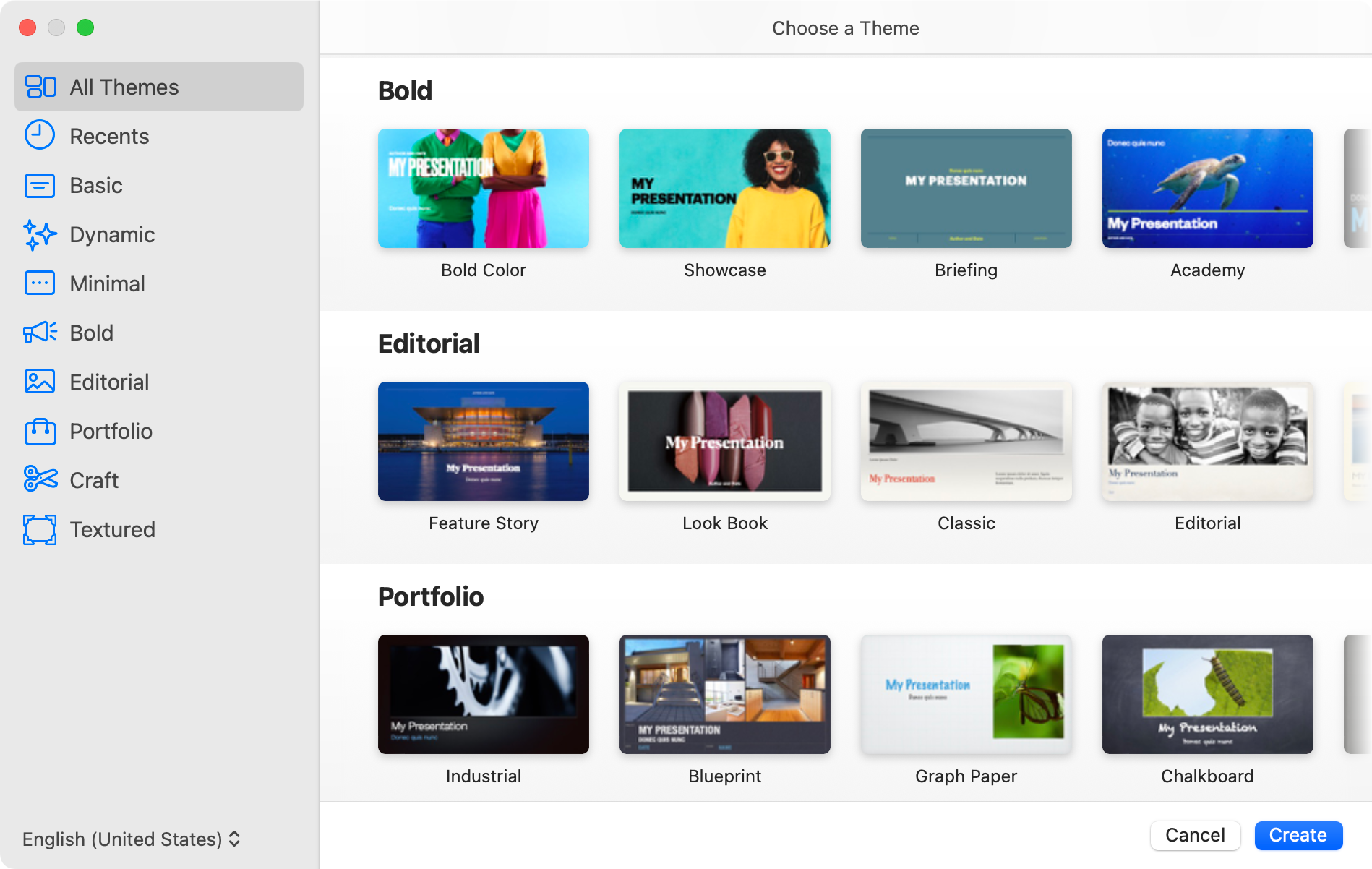
Even if you don’t like the theme, does it contain elements that grab your attention? Do you like the color scheme? Does it use graphics or photography in an interesting way? You can always use these themes or those you find online from past presentations for ideas, and then tweak them to make them your own.
If I’m not required to use a standardized template provided by the conference, I prefer to design my own slides because I can match them to the mood of my presentation. Along the way, I’ve learned a few techniques.
You want to consider these three design dimensions that generally go into every presentation:
- Color
- Type
- Pictures
Life is like a box of crayons
Colors are an important choice in a presentation.
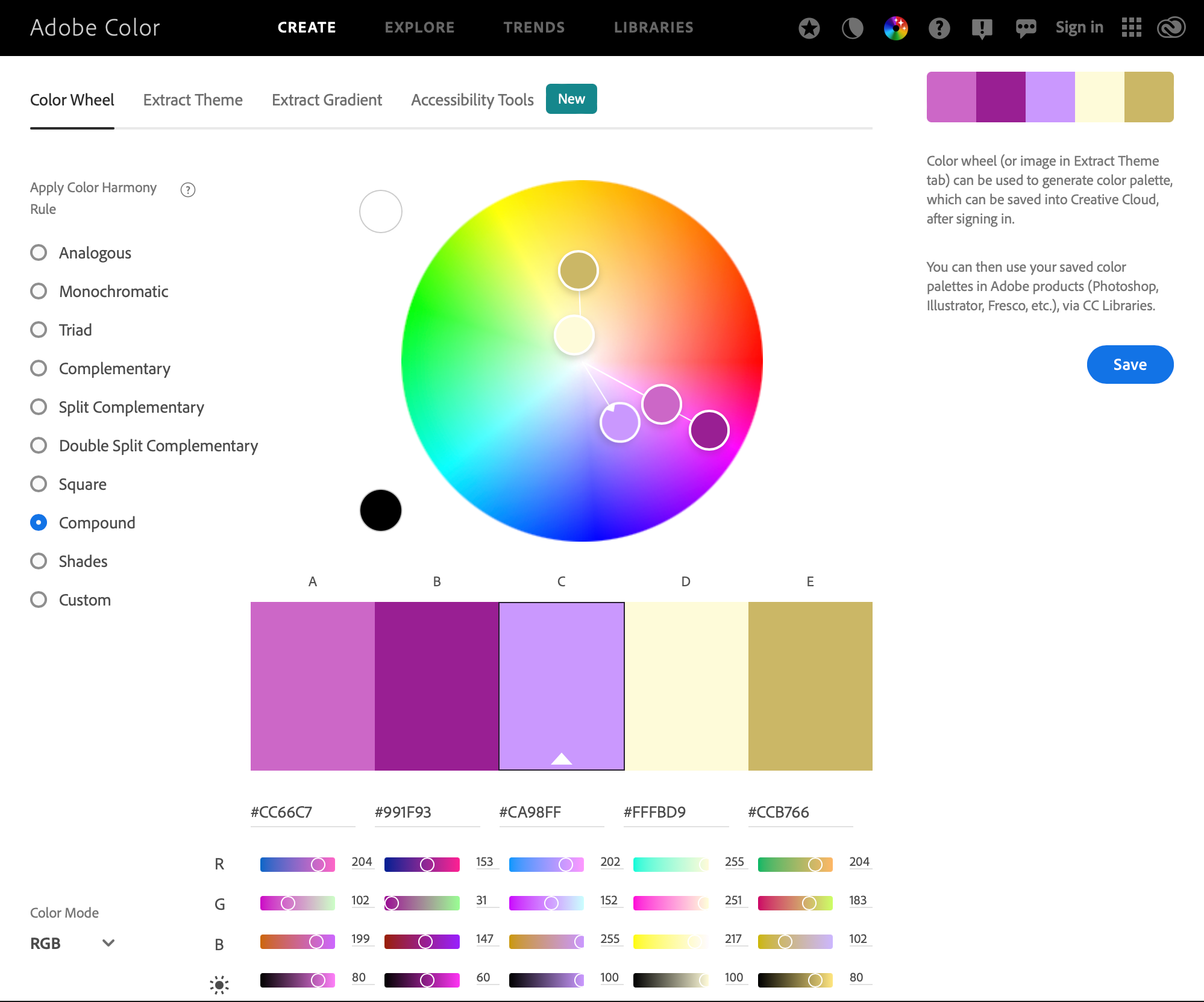
I don’t know much about color theory and certainly can’t teach anything about it, but online tools help me make smarter choices when I don’t understand the science. I love using Adobe Color to help me pick a color palette. Even a palette of a couple complementary colors plus black and white can make for an eye-popper.
Here’s what I do.
First, I choose a color harmony rule (or color scheme) on the left. Color harmony means color combinations are aesthetically pleasing. It keeps me from trying to mix light pastel colors with something like burnt orange or chocolate brown. Most anyone could look at that mix of colors and say, “I don’t know why, but something is just wrong!”
Depending on the color scheme, the color wheel in the middle of the page will show two to five circles, each highlighting a color that falls nicely in the color palette. One of those circles has a tiny arrow. This color corresponds to the middle color in the color palette below. I’ll grab that circle with my cursor and start moving it around the color wheel, watching the color palette change.
When I see a combination of colors I like, I’ll take it to Keynote and do some testing there. Usually, I’ll stick with two colors plus black and white. Here’s a mockup of some slides with the same colors in different combinations.
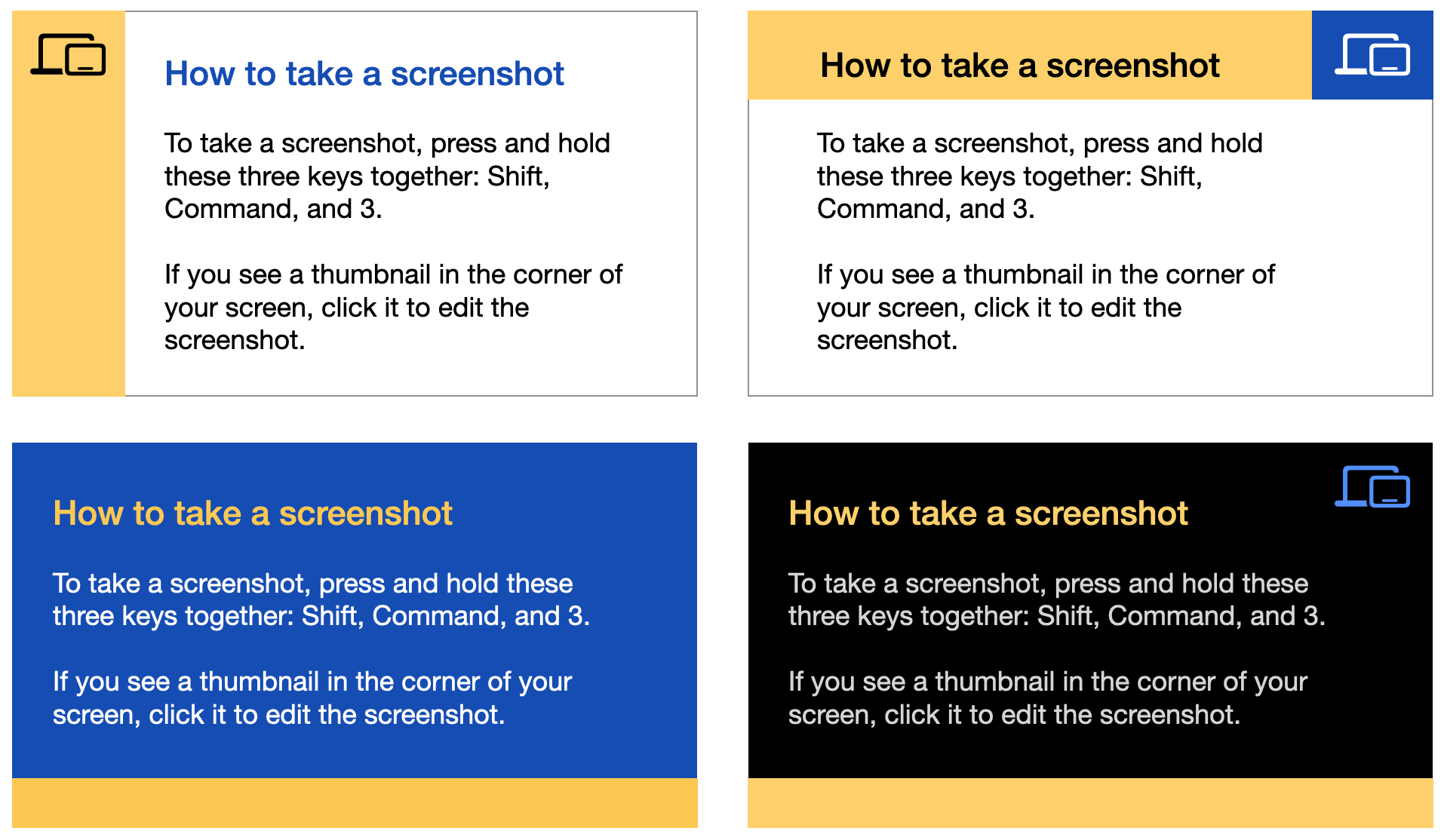
I really like the bottom two ideas because dark backgrounds make content pop. I could even use both styles in the same presentation and my presentation would be cohesive.
Comic Sans is just my type
Not really.
It’s easy to choose a typeface that’s ugly and unreadable. But it’s just as easy to choose a typeface that’s clean and visible from the back of a room. I have a few rules I follow.
Limit your fonts to what comes with macOS
You may not be presenting from your own laptop. Or your laptop may fail, and you’ll have to use another one. Limiting your fonts to those provided with the operating system also reduces your anxiety over picking just the right font. Apple provides a list of system fonts.
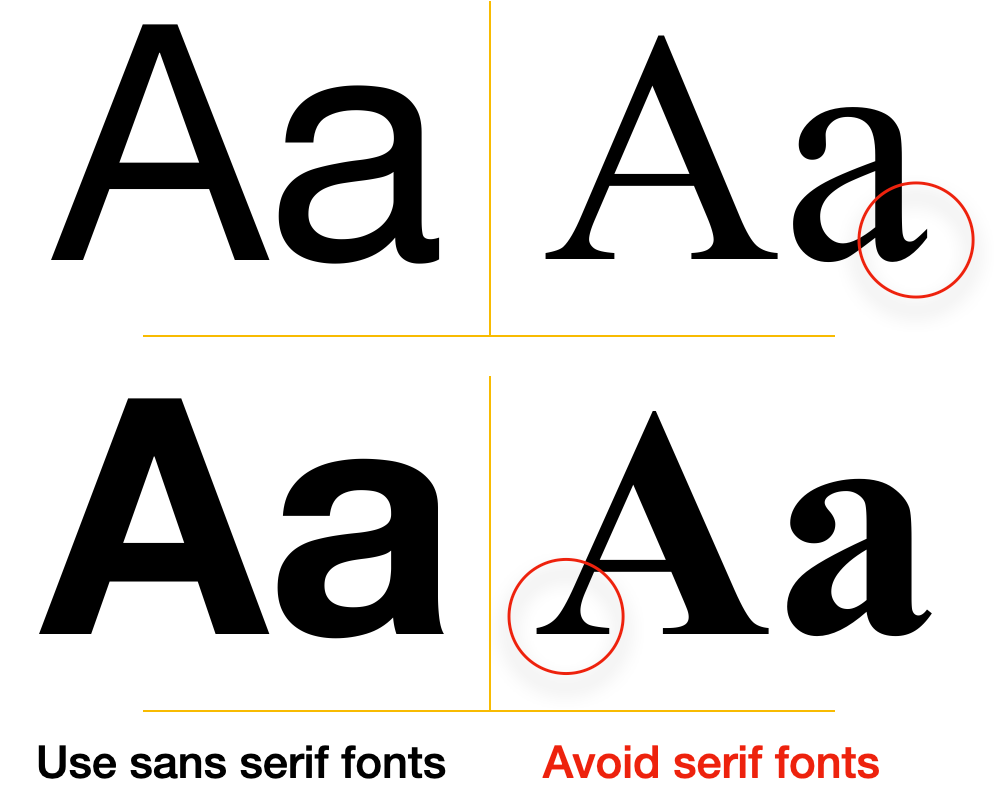 Use a sans serif font
Serif means “foot” or “feet”. They’re those little strokes and swooshes on a letter that round out the edges or bases. Sans serif mean “without feet”. Helvetica is the most common sans serif family while Times New Roman is the most common serif family.
Sans serif fonts make reading a book about 12-15 inches from your eyes much easier, but if you pull the book away, its gets more difficult to read. Serif fonts are great for long distances like large screens in front of an audience that’s sitting meters or yards away.
Choose a type family with multiple weights
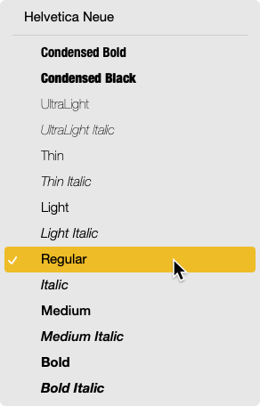
Just like picking complimentary colors, you want to choose complimentary fonts. The easiest way to do that is pick one family of fonts with multiple variations like Helvetica Neue. Helvetica Neue checks all the boxes because it’s a macOS system font, sans serif, and has 14 variations including italic.
I love using Helvetica Neue Light for my primary text with either Medium or Condensed Bold for headers and titles.
Pick a font to display code
In a technical presentation, you may want to show a script snippet or some code. Code is generally displayed using a monospace font (like a typewriter where all letters are the same width). macOS comes with a few monospace fonts including Courier New, Andale Mono, and PT Mono. Courier New and PT Mono come with at least a couple of variants (regular, bold, or italic) whereas Andale Mono is just a single variant.
Take screenshots of other fonts
Sometimes, I want to embellish a slide with a letter from a non-system font. I’ll take a screenshot of it because I’m really using it as artwork, and this avoids any font issues when using someone else’s computer to show my presentation sides.
Keep in mind that choosing a basic or commonly used font doesn’t mean you’re choosing a boring font. It means you’re choosing legibility, which is more important.
Picture this
Presentations are a visual medium. In addition to colors and fonts, the best way to add impact to a presentation is to add graphic elements.
Use screenshots
Screenshots are the easiest graphic elements you can add to a slide, and they convey a lot of meaning to an audience already familiar with Macs, iPhones, or iPads. For my full-screen Mac screenshots, I do a little setup:
- Set the wallpaper to a still (non-dynamic) version of the default macOS wallpaper
- Change the clock from digital to analog
- Empty the trash
- Disable recent apps in the dock
- Disable all locations in the sidebar
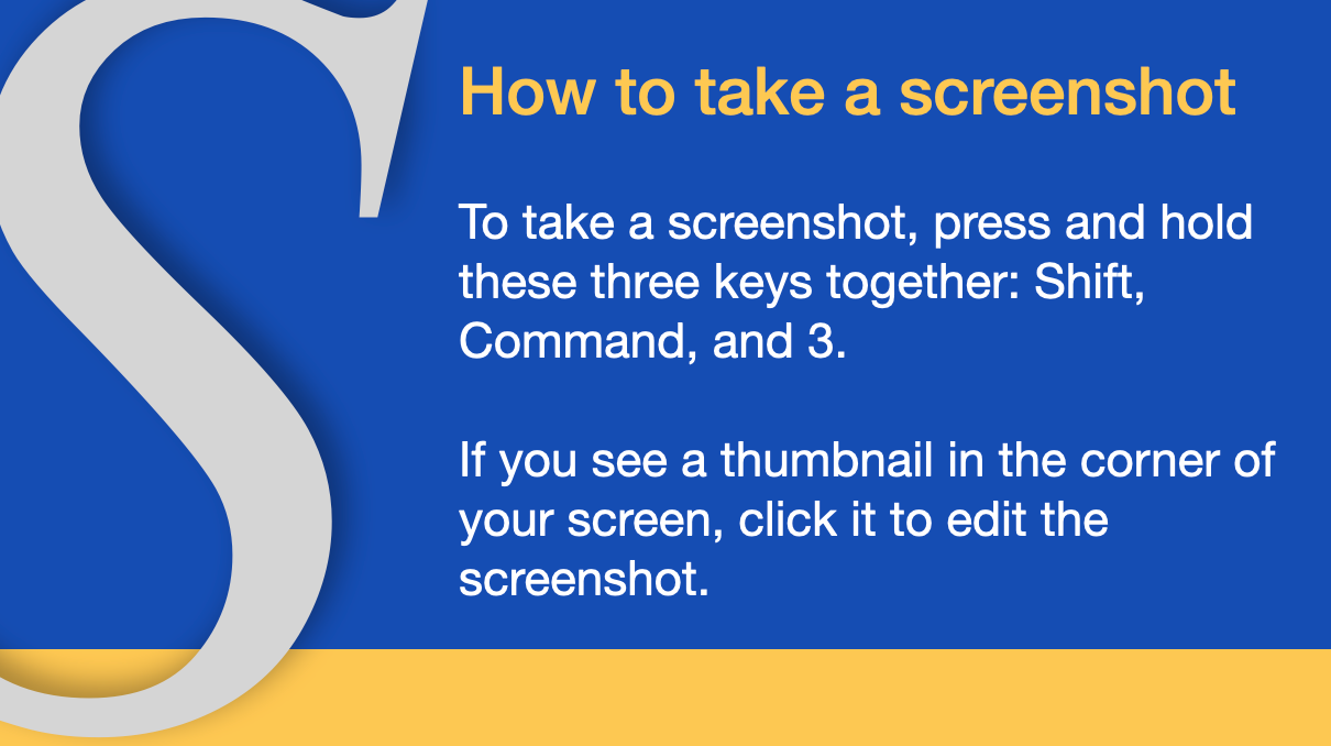
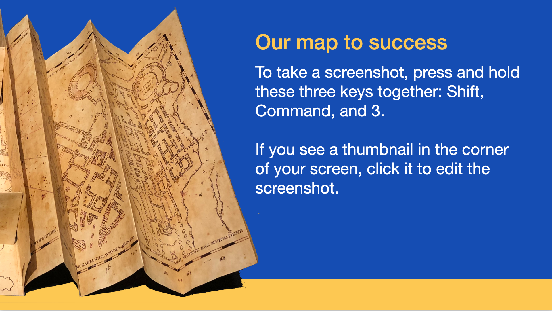
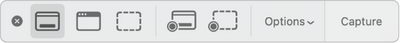 Remember the keyboard command Shift + Command + 5. This invokes macOS’s Screenshot app, which offers a small control palette to let you choose a screenshot or screen recording with several configurable options.
As you take your screenshot, press the spacebar to switch between selecting an area to selecting a window. And press Option as you click a window to remove macOS’s default shadow.
Use Apple’s design resources
If you’d like to show your computer, iPhone or iPad screenshot as if it were on the actual device, Apple offers downloadable design resources like product bezels as well as badges and logos. The PNG formats include alpha channels with “holes” in the bezels for you to place your screenshots.
Along with these resources, Apple also includes the SF Symbols font with thousands of clean and modern icons. These are the same icons Apple and developers use in their products to give everything a cohesive look. Remember, take screenshots if you use this font because it’s not a built-in system font.
Use your own photos
If you’re telling a story with your presentation (and you should), add your own photos to show your narrative. And remember that a picture is worth a thousand words. Maybe you took pictures during an iPad rollout. They can illustrate the culmination of the hard work you put in to make deployment easy.
Or you can use your photos as graphic elements because you want to avoid potential copyright infringement. All photos and graphics on the internet belong to someone else. While it’s easy to find just the right image, the owner may have an issue with you repurposing it. Use images in the public domain and keep a record of the usage rights with the image, just in case. Otherwise, steal from your own collection of photos. Below is a picture I took of the Marauder’s Map from a Harry Potter museum.
I own the photo and I’ve used macOS’ built-in Preview app to quickly remove the background. The original image was twice as big as what I’m showing here. To add visual interest, I’m letting the left half hang off the slide.
Use Keynote’s built-in shapes
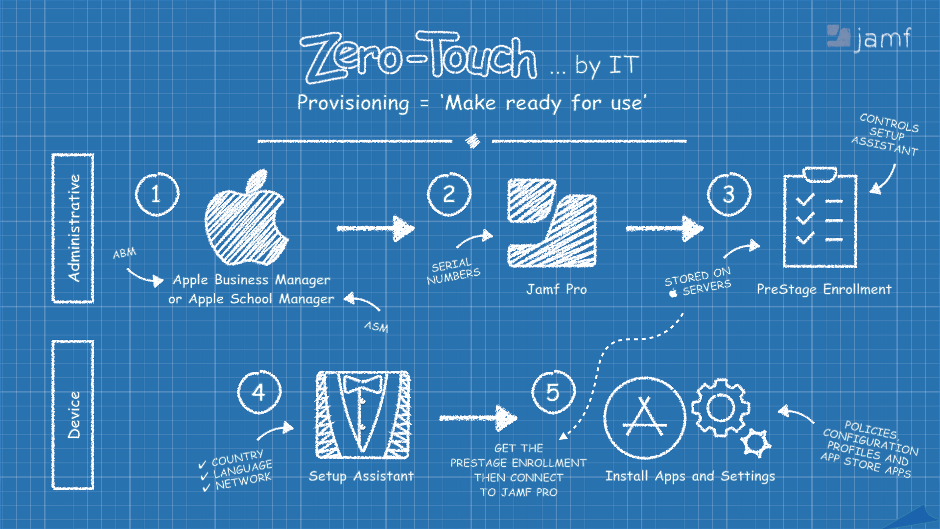
Most presentation software comes with a library of graphic elements. You can resize them, reshape them, give them different colors, and even use them to create graphics of your own. For a presentation a few years ago, I inserted the cog symbol from Keynote’s shapes library, applied a stylized line that looked hand-drawn, duplicated it, and scaled and rotated it.
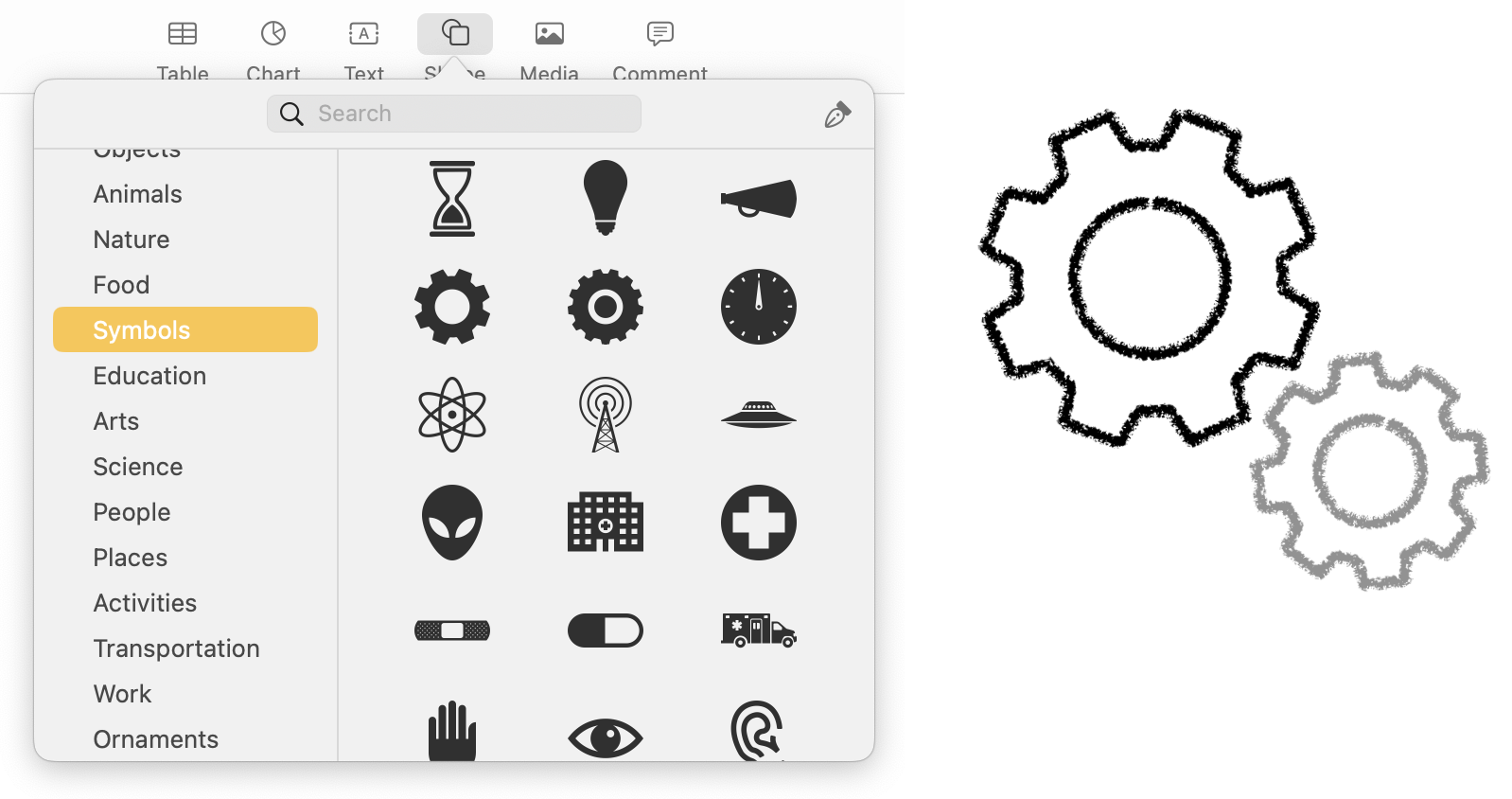
The result, along with similar efforts, provided me a slide that looked somewhat like a blueprint drawing.
Don’t feel you need to incorporate all these image techniques. You should stick with mostly photos or stick with mostly graphic elements to ensure your slides look like they’re part of the same presentation.
Your homework
Earlier, I mentioned three design dimensions that generally go into every presentation:
- Color
- Type
- Pictures
Next time, I’ll cover a fourth dimension — animation. No rule says your images can’t move! Until next time :
- Start designing your slides. They may influence your writing, so it’s not a terrible practice to begin with your presentation’s look and feel.
- If you’re not a designer, that’s OK! Use Keynote’s built-in templates as a starting point or find free templates online. Think of a feeling or mood and start there. Modify what you find to fit your vision.
- Look at presentations from earlier conferences. Steal what you liked. Leave what you didn’t like.
- Use color! But don’t use a lot of colors. Stick with a dark background (black, dark gray, dark blue, taupe, or something else) and pick a bright contrasting color. Make that your primary text color. Find a complimentary color on the color wheel you can use for titles and callouts. Remember that black and white are complementary to most color palettes.
- Keep your fonts simple. Stick with fonts that come with macOS and stick with a family of fonts that has a wide variety of variants like Helvetica Neue.
- Each slide should contain a thought expressed in text and/or graphics. Always be thinking of a way to illustrate your ideas. No one likes to read just bullet points. And remember, you have a lot of resources at your disposal. Don’t be afraid to create what you’re picturing in your mind.
Who says fonts aren’t funny?
Times New Roman and Helvetica walk into a bar. The barkeep says “We don’t serve your type here”.
There’s nothing wrong with the Tower of Pisa. It was just built in italics.
What’s the best font for writing swear words? Any cursive font.
Waiter: Do you have any questions about the menu?
Me: What font is this?

