- Jamf Nation Community
- Products
- Jamf Pro
- Re: Jamf 10.48 dashboard re-design - Bold Choices!
- Subscribe to RSS Feed
- Mark Topic as New
- Mark Topic as Read
- Float this Topic for Current User
- Bookmark
- Subscribe
- Mute
- Printer Friendly Page
Jamf 10.48 dashboard re-design - Bold Choices!
- Mark as New
- Bookmark
- Subscribe
- Mute
- Subscribe to RSS Feed
- Permalink
- Report Inappropriate Content
Posted on 07-12-2023 02:52 AM
While I welcome updates that make things better, I'm not sure the new font choice / bold type in 10.48 is an improvement on the dash board.
All uppers worked well, now its upper and lower.. which im not sure is more readable.
Bold.. this does not work for me, maybe it works for others?
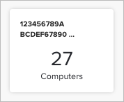
some smart groups that were once fully readable are now cut at the end, meaning you can't see the ending, making some groups look identical. Renaming these is not an option due to how JAMF uses names for reference.
Display preferences are somewhat lacking (dark mode) but an option to toggle this back to Uppers / No bold would be welcome.
- Mark as New
- Bookmark
- Subscribe
- Mute
- Subscribe to RSS Feed
- Permalink
- Report Inappropriate Content
Posted on 07-12-2023 03:29 AM
can you share a screenshot for those of us who haven't updated yet?
- Mark as New
- Bookmark
- Subscribe
- Mute
- Subscribe to RSS Feed
- Permalink
- Report Inappropriate Content
Posted on 07-12-2023 04:04 AM
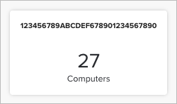
still working out how this has changed, but now the boxes are dynamically sized to the text, they don't wrap.
30 char smart group (say if you use hyphens in you naming)
now with a space at 10 chars and another space 10 along, drops the rest of the text
And upper and lower and bold
- Mark as New
- Bookmark
- Subscribe
- Mute
- Subscribe to RSS Feed
- Permalink
- Report Inappropriate Content
07-12-2023 10:04 AM - edited 07-12-2023 10:06 AM
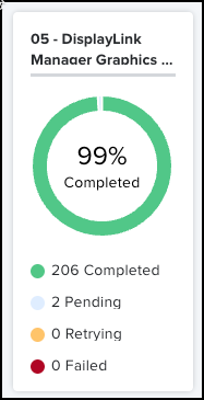
Category font is looking outsized compared to policy names.. this is zoomed out.. otherwise its comical.. by the time you have the category a 'normal' size, everything else it tiny.. It was not like this before upgrade.. Sure the font is lighter weight than before..
- Mark as New
- Bookmark
- Subscribe
- Mute
- Subscribe to RSS Feed
- Permalink
- Report Inappropriate Content
Posted on 07-13-2023 01:51 AM
I'm sorry - but the entire new dashboard is a complete design fail! As a full-time (UX) designer and owner of a corresponding agency, I would like to give you the following feedback:
The colors before were clear and quick to grasp, the typo easier to separate and quicker to grasp.
Now I see less quickly which policy it is and it is also less quick to grasp which policy is still lagging behind. It may be that the colors are easier to separate for people with visual impairments - but why are you doing this at the expense of people without visual impairments?
Putting everything BOLD (including the rings doesn't do it any good either. Actually, it's a complete step backwards - also design-wise: that's how it was designed in the 90s. I would be happy if you would return to somewhat thinner rings (which then also leave more space on the screen - e.g. for typo - and do not immediately overload everything) and clearer colors.
Please!
- Mark as New
- Bookmark
- Subscribe
- Mute
- Subscribe to RSS Feed
- Permalink
- Report Inappropriate Content
Posted on 07-13-2023 01:53 AM
Just get back and stay more elegant!
- Mark as New
- Bookmark
- Subscribe
- Mute
- Subscribe to RSS Feed
- Permalink
- Report Inappropriate Content
Posted on 07-14-2023 03:09 AM
meanwhile other changes still seem harder to read or at least harsher.. the bold type face is not an improvement and the added line weight its really not useful.. subjective. yes.. but user interface improvements need to improve things.. not make it harder?
- Mark as New
- Bookmark
- Subscribe
- Mute
- Subscribe to RSS Feed
- Permalink
- Report Inappropriate Content
Posted on 07-14-2023 04:19 AM
Yes! At the beginning I thought some things were just a bit unfamiliar - as is always the case with changes. But we're just realizing here, independently of each other and independent of questions of taste, that we would tend to describe the redesign unfortunately as really unsuccessful.
We strongly hope that Jamf will think better of this and take things back. However, we know from the past that companies do not want to jump over their shadows and respond to the user.
- Mark as New
- Bookmark
- Subscribe
- Mute
- Subscribe to RSS Feed
- Permalink
- Report Inappropriate Content
Posted on 07-14-2023 04:56 AM
We have not gotten the upgrade yet since we're in the cloud, but I do prefer the darker text. It has better contrast and is easier to read than the light gray on white. Jamf's UI team has been extremely slow to respond to our input. Remember when they went from version 9 to version 10 and there were screams from us about how horrible the color pallet was? It was light gray and light blue on white - extremely hard to read when you're staring at the console all day long. I used photoshop to sample the colors and the color values on some elements were only a couple points different. It gave me constant headaches every single day. They did eventually darken SOME aspects of the interface to create just a weee bit more contrast years later. It is still very hard for me to look at. The Jamf UI team really does not care about your concerns. However, maybe the 10.48 update will reduce my headaches and severe eye strain. I'm not going to hold my breath.
- Mark as New
- Bookmark
- Subscribe
- Mute
- Subscribe to RSS Feed
- Permalink
- Report Inappropriate Content
Posted on 07-24-2023 06:44 AM
Just got 10.48.1 this weekend, logged in this morning and is it me or did the font change to a smaller Arial Black font on the Dashboard? Seems to be hard on my eyes. This is a really bad design, any way to maybe change the font in Chrome?
- Mark as New
- Bookmark
- Subscribe
- Mute
- Subscribe to RSS Feed
- Permalink
- Report Inappropriate Content
Posted on 07-24-2023 06:46 AM
Same here. Still horrible. We had hope that there would be improvements. But it continues to be incredibly bad.
- Mark as New
- Bookmark
- Subscribe
- Mute
- Subscribe to RSS Feed
- Permalink
- Report Inappropriate Content
07-24-2023 06:57 AM - edited 07-24-2023 06:58 AM
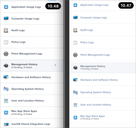
Before and after the update... I thought it was my glasses when I logged in this morning... 🤓
Making it small and Bold doesn't make it more readable!!!
- Mark as New
- Bookmark
- Subscribe
- Mute
- Subscribe to RSS Feed
- Permalink
- Report Inappropriate Content
07-24-2023 07:10 AM - edited 07-24-2023 07:20 AM
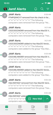
Whoever is in charge of graphic design should be fired. They screwed up the Jamf emails also, putting something in the beginning of the text. The text isn't formatting anymore, like it was before 10.48....
From JAMF for the email issue: "It looks like we are currently running into a known open Product Issue (PI111954). This issue was first reported in Jamf Pro version 10.47. At present, we see that the issue will be resolved in Jamf Pro 10.49."
- Mark as New
- Bookmark
- Subscribe
- Mute
- Subscribe to RSS Feed
- Permalink
- Report Inappropriate Content
Posted on 07-24-2023 07:16 AM
Hello Jamf!??? Is someone reading this? Can you forward this to the people in charge?
- Mark as New
- Bookmark
- Subscribe
- Mute
- Subscribe to RSS Feed
- Permalink
- Report Inappropriate Content
Posted on 07-25-2023 06:44 AM
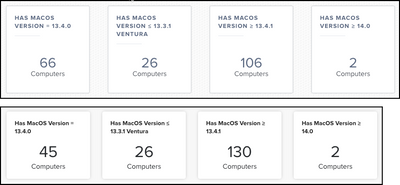
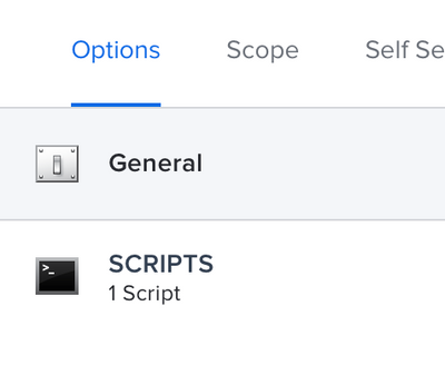
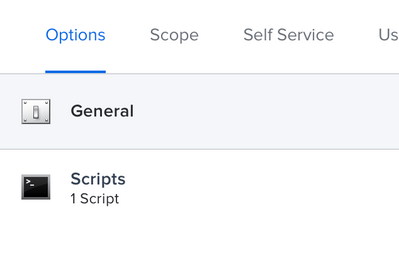
I just discovered a very odd inconsistency. 2 different policies that only run scripts:
I have not tinkered with the policies, nor photoshopped the images. These screenshots were taken only seconds apart, yet for some reason one of the policies says SCRIPTS while the other says Scripts.
- Mark as New
- Bookmark
- Subscribe
- Mute
- Subscribe to RSS Feed
- Permalink
- Report Inappropriate Content
07-25-2023 09:43 AM - edited 07-25-2023 09:56 AM
interesting workaround for some of these design choice.. the new(ish) Arc browser (Chromium based) has a novel feature called 'boosts' this allows you to override some of the design with font choice / size / colour / invert (you can also add CCS / JS)
Its not a solution.. but for the first time I have JAMF in a dark mode that I can work with..
AND.. I can set the font to one I can read AND I can make it all caps (or you can make it all lower, mixed)
email required (boo)
no affiliation..
still playing with it..
- Mark as New
- Bookmark
- Subscribe
- Mute
- Subscribe to RSS Feed
- Permalink
- Report Inappropriate Content
Posted on 07-27-2023 10:03 AM
Hey all,
We appreciate the feedback everyone has provided and our internal teams have and are currently looking into it. Please checkout the most recent comment on this post: https://community.jamf.com/t5/release-info/jamf-pro-10-48-now-available/tac-p/295759/emcs_t/S2h8ZW1h...
To see what our team had to say.
Best,
Justin
- Mark as New
- Bookmark
- Subscribe
- Mute
- Subscribe to RSS Feed
- Permalink
- Report Inappropriate Content
Posted on 10-04-2023 05:38 AM
@JustinV Hello! Is there any news about this truncation, font issues of the Dashboard. Is there a Product Issue number?
Also people, I am experiencing a blank results page from the dashboard for Smart Groups (only). They did say there is a Product Issue, PI113033 for it and will be resolved in Jamf Pro 11, next month.
- Mark as New
- Bookmark
- Subscribe
- Mute
- Subscribe to RSS Feed
- Permalink
- Report Inappropriate Content
Posted on 10-04-2023 06:25 AM
Hi, @DMH2000 - Thank you for your message. Sadly, Justin passed away, but we're working internally to get responses on this issue. We greatly appreciate your patience!
- Mark as New
- Bookmark
- Subscribe
- Mute
- Subscribe to RSS Feed
- Permalink
- Report Inappropriate Content
Posted on 10-04-2023 06:29 AM
@JeniA Even though I didn't know him, my sympathies go out to his family and the Jamf team. He seemed so young.
- Mark as New
- Bookmark
- Subscribe
- Mute
- Subscribe to RSS Feed
- Permalink
- Report Inappropriate Content
Posted on 10-04-2023 06:33 AM
Thank you, @DMH2000. We appreciate it. He was young, but he LOVED supporting the community, so thank you for giving him meaningful work over the last year!
- Mark as New
- Bookmark
- Subscribe
- Mute
- Subscribe to RSS Feed
- Permalink
- Report Inappropriate Content
Posted on 07-31-2023 06:29 AM
Just wanted to add that now the Dashboard is limiting the title to 2 lines also... Not very nice...
- Mark as New
- Bookmark
- Subscribe
- Mute
- Subscribe to RSS Feed
- Permalink
- Report Inappropriate Content
08-21-2023 06:25 AM - edited 08-21-2023 06:25 AM
Also, it really doesn't support 2 lines! The bottom of any 'dangling' letters are cut off... (g,p,y...)
- Mark as New
- Bookmark
- Subscribe
- Mute
- Subscribe to RSS Feed
- Permalink
- Report Inappropriate Content
Posted on 10-03-2023 06:23 PM
Just wanted to chime in that the dashboard has been rendered completely useless with the truncation of Smartgroup titles.
- Mark as New
- Bookmark
- Subscribe
- Mute
- Subscribe to RSS Feed
- Permalink
- Report Inappropriate Content
10-10-2023 10:25 AM - edited 10-10-2023 10:25 AM
Thank you for your feedback. Our Jamf product team cares deeply about what our customers have to say, and we encourage you to continue to provide that feedback here or submit a feature request via your profile > submit a feature request.
- Mark as New
- Bookmark
- Subscribe
- Mute
- Subscribe to RSS Feed
- Permalink
- Report Inappropriate Content
Posted on 10-04-2023 01:57 AM
Seems like the guys at Jamf don't care! There are a number of comments on the completely failed redesign. But they probably hope that these are "habitual" things and the grumbling will stop. But it is and remains a fail!
- Mark as New
- Bookmark
- Subscribe
- Mute
- Subscribe to RSS Feed
- Permalink
- Report Inappropriate Content
Posted on 10-04-2023 06:30 AM
@jlattke We appreciate all of the feedback, as it always helps us learn. The member of our team who was following these comments recently passed away, so we appreciate your patience and understanding as we regroup and determine the best ways to support you moving forward. If you ever feel something isn't being addressed, feel free to reach out to me directly. Thanks for your participating in Jamf Nation!
