- Jamf Nation Community
- Products
- Jamf Pro
- Re: Introducing Jamf Pro Dark Mode (unofficial)
- Subscribe to RSS Feed
- Mark Topic as New
- Mark Topic as Read
- Float this Topic for Current User
- Bookmark
- Subscribe
- Mute
- Printer Friendly Page
Introducing Jamf Pro Dark Mode (unofficial)
- Mark as New
- Bookmark
- Subscribe
- Mute
- Subscribe to RSS Feed
- Permalink
- Report Inappropriate Content
Posted on 03-31-2019 09:46 PM
Hey all,
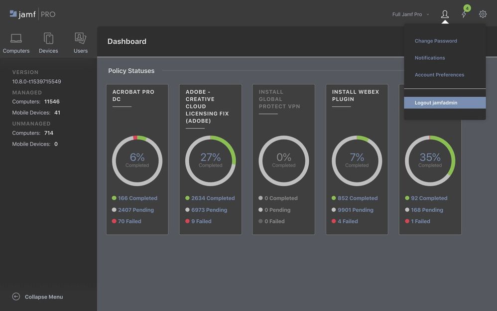
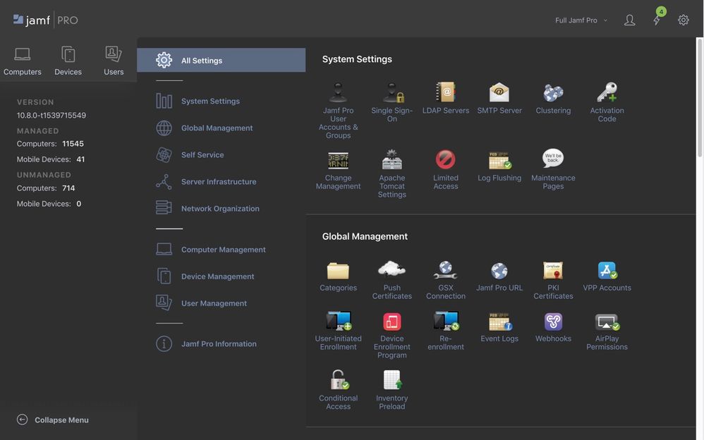
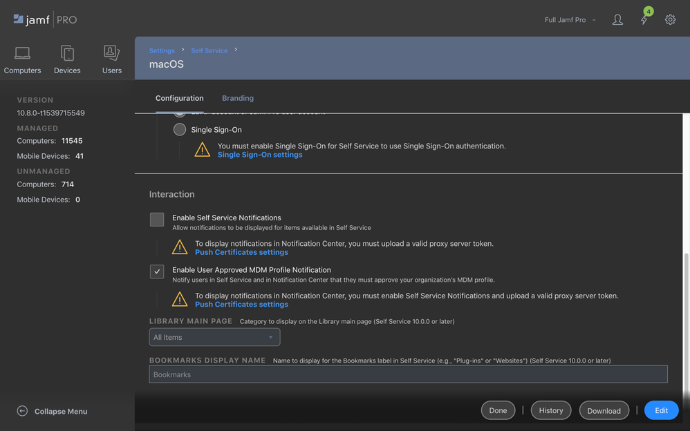
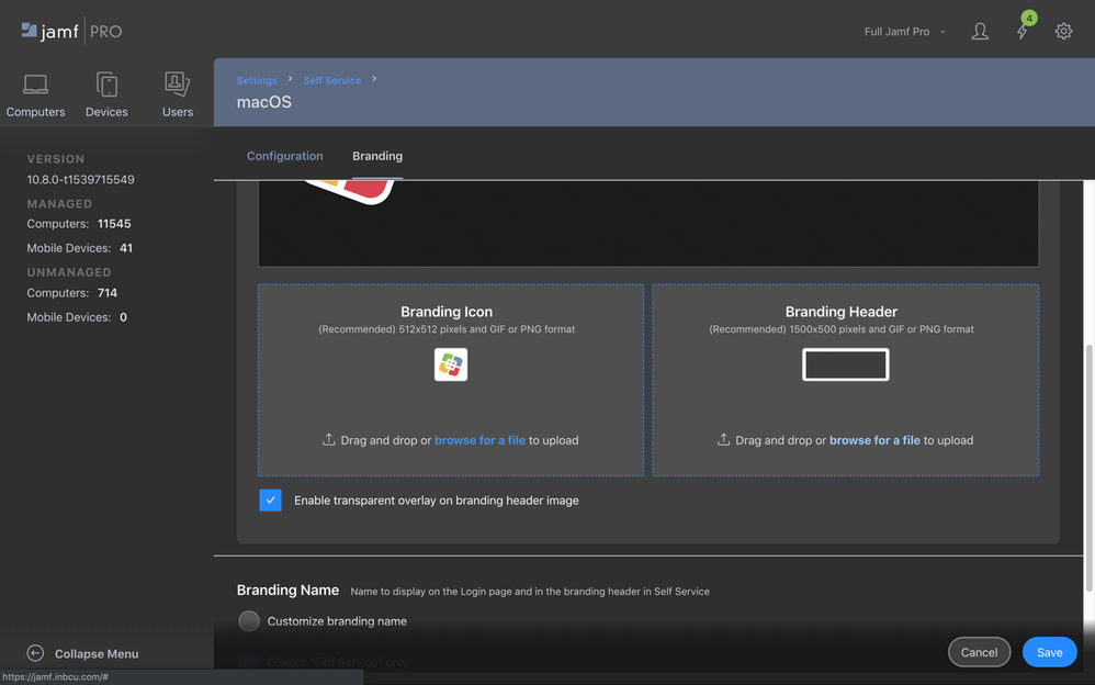
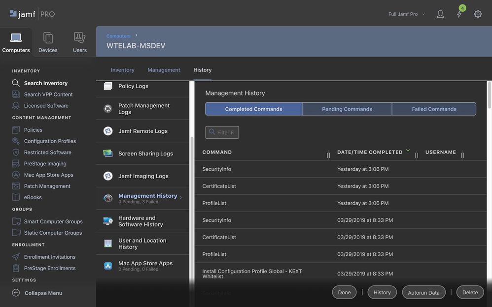
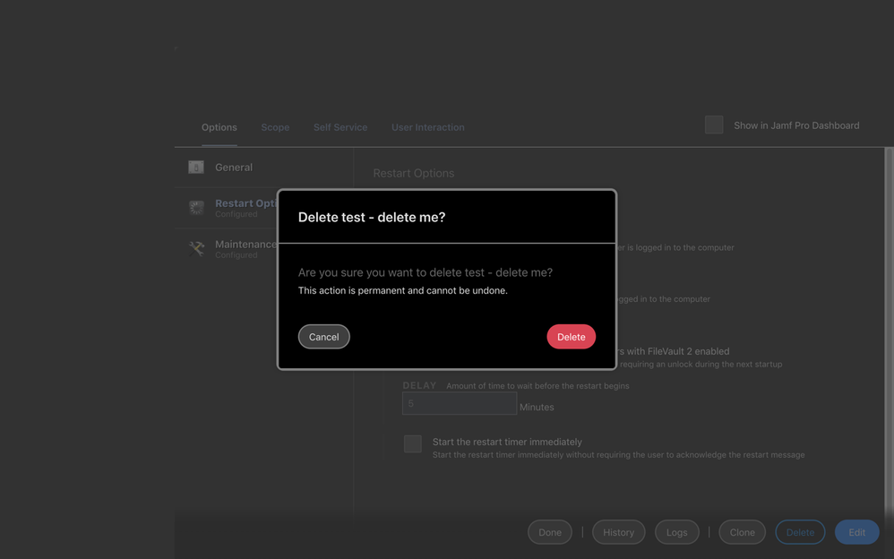
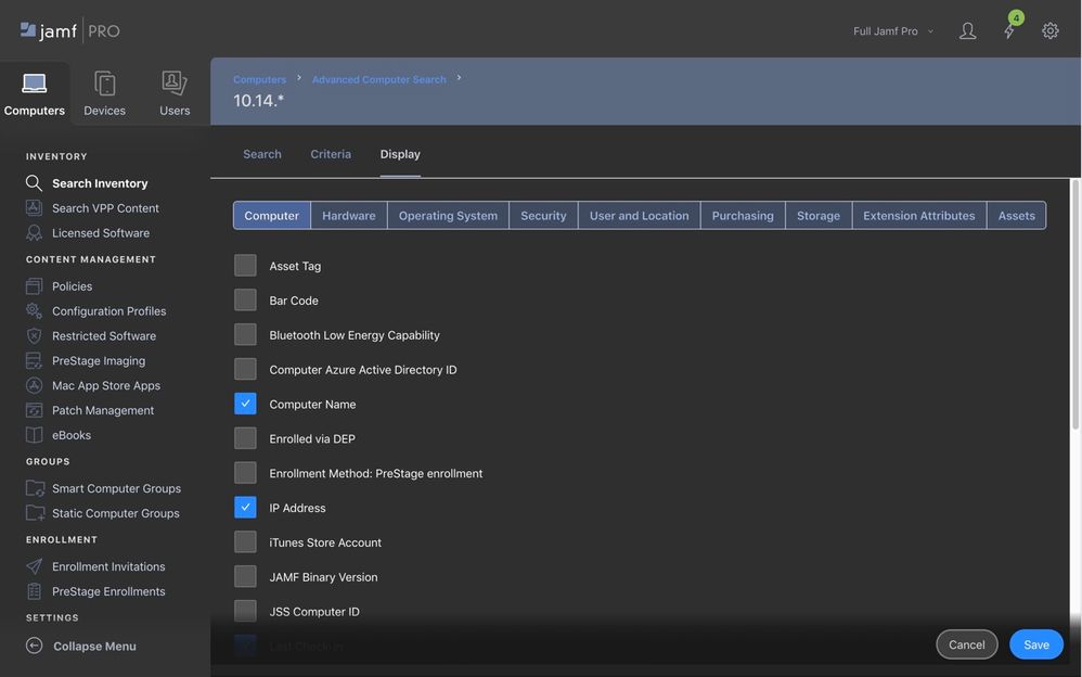
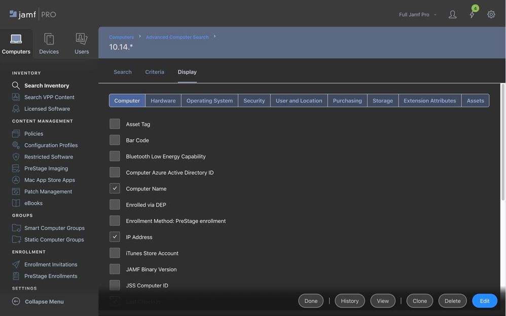
I made a thing to save my eyes (and hopefully yours):
https://userstyles.org/styles/170527/jamf-pro-dark-mode
GitHub Source
Please read the installation notes carefully to activate the style.
Tested pretty extensively in Chrome; works in Firefox too. Unfortunately Safari is not possible at the moment until Stylish (or someone else) submits an app for Mojave / Safari 12. While Safari can load custom CSS via Preferences > Advanced, Jamf's CSS has some 'global' declarations in the first few lines for typefaces and I can't easily work around that AFAIK.
This is my first attempt to do anything remotely approaching 'front end web development' in over a decade. If I've missed anything obvious or made an amateurish / inefficient CSS gaffe, please let me know here and/or make code suggestions at my github repo.
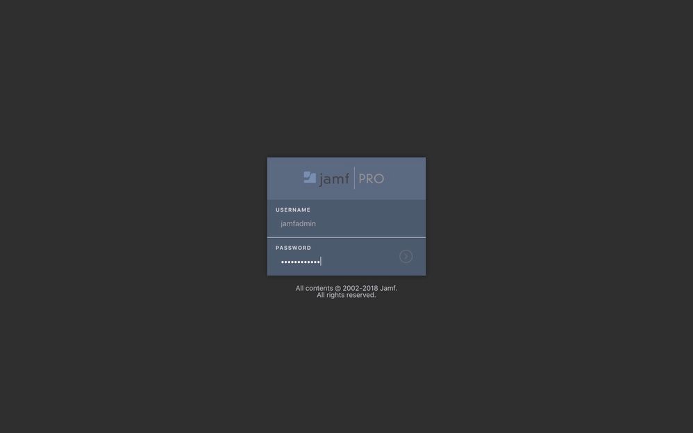
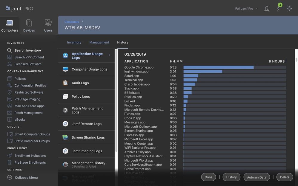
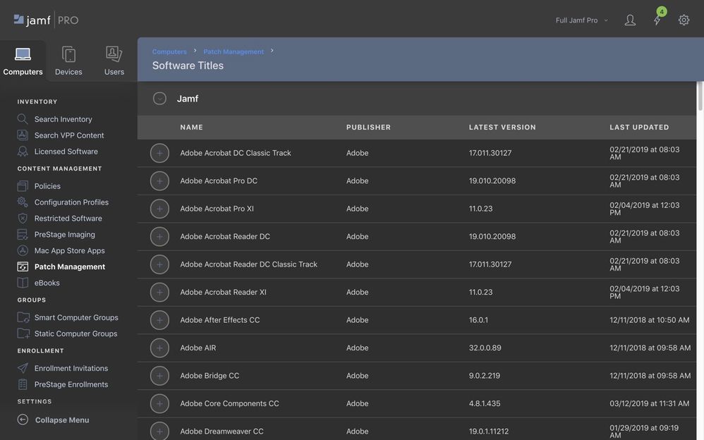
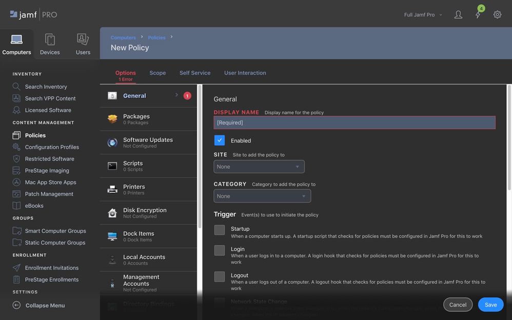
I've uploaded some screenshots here to whet your appetite.
- Labels:
-
Jamf Pro
-
Tips & Tricks
- Mark as New
- Bookmark
- Subscribe
- Mute
- Subscribe to RSS Feed
- Permalink
- Report Inappropriate Content
Posted on 04-01-2019 06:16 AM
@bradtchapman That does look great!
- Mark as New
- Bookmark
- Subscribe
- Mute
- Subscribe to RSS Feed
- Permalink
- Report Inappropriate Content
Posted on 04-01-2019 06:46 AM
This is the greatest Monday I've ever had! Nice job on this!
- Mark as New
- Bookmark
- Subscribe
- Mute
- Subscribe to RSS Feed
- Permalink
- Report Inappropriate Content
Posted on 04-01-2019 09:14 AM
I love this, but I must be an idiot, because for some reason I can't get this working in Firefox. I haven't used Stylish before, but I have the add-on installed and also have the style sheet installed. I think I followed the instructions on changing the Applies to line correctly and saved. Even restarted Firefox. Still not seeing the style sheet apply, so I'm obviously doing it wrong somewhere.
Does this work with both cloud hosted and on-prem installs, or just the latter?
Edit: I also tried the instructions off your GitHub page, after removing the previously installed style. Still no dice. I'm still seeing a lot of white panels.
Edit 2: Ok, got it to work. I'm not sure if this is common knowledge that I just never had, but the URL you enter cannot have the https:// in the beginning of it it seems. I did not know that. So just thought I'd post that here in case anyone else runs into that.
@bradtchapman Thanks for putting this together. Clearly a lot of work, so it's greatly appreciated! Jamf really should make something like this official.
- Mark as New
- Bookmark
- Subscribe
- Mute
- Subscribe to RSS Feed
- Permalink
- Report Inappropriate Content
Posted on 04-01-2019 09:15 AM
@bradtchapman eye candy, for sure :)
- Mark as New
- Bookmark
- Subscribe
- Mute
- Subscribe to RSS Feed
- Permalink
- Report Inappropriate Content
Posted on 04-01-2019 09:20 AM
@mm2270 - I don’t have a cloud instance to verify, but it should work on both since the style sheet would be the same.
When you look at the style in the Stylish editor, you should not see a @moz-document line at the top. Stylish filters that out, but they required me to choose a domain so I had configured it initially for jss.pretendco.com . Only Firefox respects this setting. You need to change the “applies to” setting to match your site. I recommend “URLs in the domain” instead of just URL.
Is the style enabled?
- Mark as New
- Bookmark
- Subscribe
- Mute
- Subscribe to RSS Feed
- Permalink
- Report Inappropriate Content
Posted on 04-01-2019 09:26 AM
@bradtchapman Thanks! See my edit #2 to my post above. I wasn't aware it could not have the https:// in the URL. Once I removed that it worked immediately!
- Mark as New
- Bookmark
- Subscribe
- Mute
- Subscribe to RSS Feed
- Permalink
- Report Inappropriate Content
Posted on 04-01-2019 09:28 AM
Thank you @mm2270 ! That means a lot. Glad it’s helping folks.
- Mark as New
- Bookmark
- Subscribe
- Mute
- Subscribe to RSS Feed
- Permalink
- Report Inappropriate Content
Posted on 04-01-2019 03:42 PM
I found a few more little oversights this morning and updated the github as well as Stylish. It was some 'small' Jamf buttons, and the 'completed' stage of the Jamf Assistant which you'd only see when exporting reports from a search. Oddly enough, I hadn't actually tested that. 😅
Very happy that so many people liked this and found it useful!
If you installed this from Stylish, go back to the link at userstyles.org and click "Update Style."
(Jamf: if you're listening, your customers really want a native dark mode!)
- Mark as New
- Bookmark
- Subscribe
- Mute
- Subscribe to RSS Feed
- Permalink
- Report Inappropriate Content
Posted on 04-02-2019 02:35 AM
Great!!!
- Mark as New
- Bookmark
- Subscribe
- Mute
- Subscribe to RSS Feed
- Permalink
- Report Inappropriate Content
Posted on 04-02-2019 07:20 AM
Loving what you've done @bradtchapman - for me I had to set the theme to apply to "URLs starting with" for it to kick in.
I've use the updated CSS from GitHub and compared to your screenshots, the annoying fade effect on scroll lists is still "Light" rather than "Dark" - am I missing a trick somewhere?
- Mark as New
- Bookmark
- Subscribe
- Mute
- Subscribe to RSS Feed
- Permalink
- Report Inappropriate Content
Posted on 04-02-2019 07:25 AM
@jsherwood Where in the JSS do you see this screen? And did you install from Stylish or Github?
- Mark as New
- Bookmark
- Subscribe
- Mute
- Subscribe to RSS Feed
- Permalink
- Report Inappropriate Content
Posted on 04-02-2019 07:40 AM
@bradtchapman I installed from Github as couldn't seem to get it to kick in at all using the CSS from Stylish.
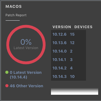
I'm (so far) seeing the light scroll on the Dashboard
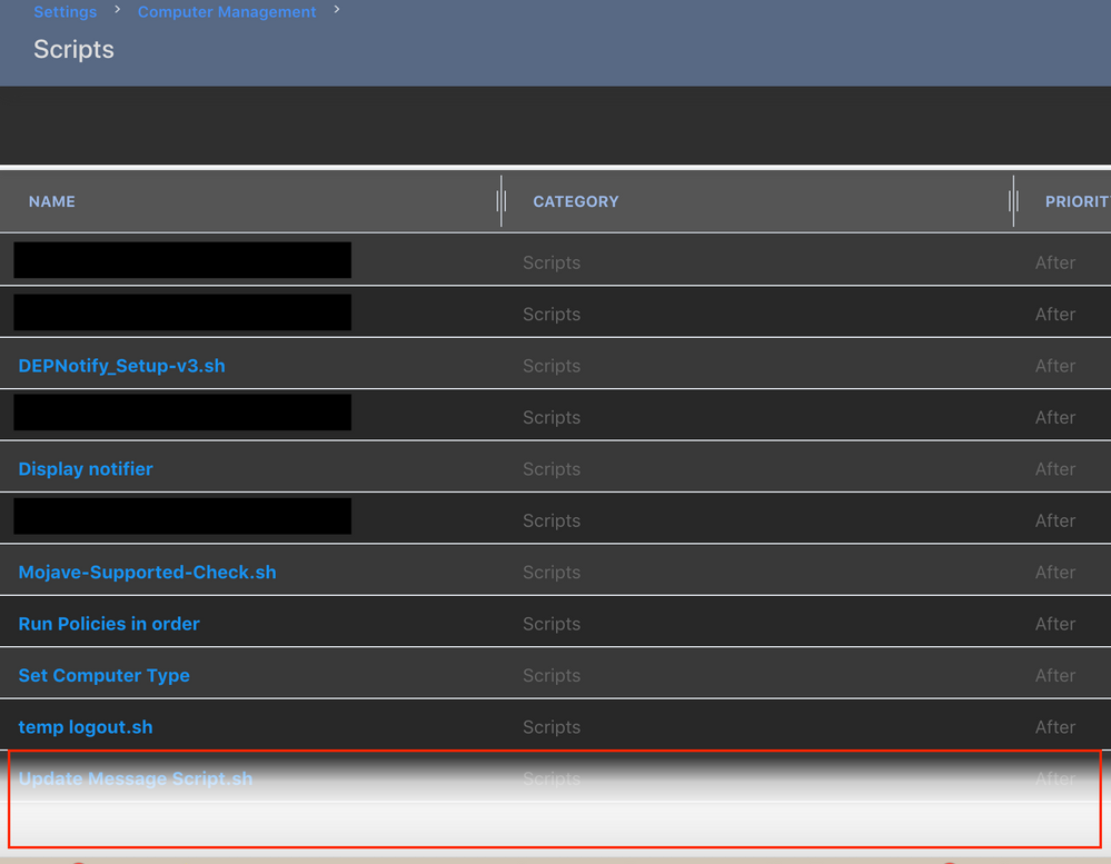
And also at the foot of the Scripts screen in Settings
I'll try and grab another Mac to test it on so see if it's my machine glitching out
- Mark as New
- Bookmark
- Subscribe
- Mute
- Subscribe to RSS Feed
- Permalink
- Report Inappropriate Content
Posted on 04-02-2019 07:48 AM
That area should either fade to black or grey, definitely not white. Can you join slack and ping me?
I’d recommend using Stylish, only because it supports updating the style if I submit changes (afaik it’s a notification, not automatic).
- Mark as New
- Bookmark
- Subscribe
- Mute
- Subscribe to RSS Feed
- Permalink
- Report Inappropriate Content
Posted on 04-02-2019 08:09 AM
FWIW, I am also seeing that fade to white in my JSS, but ONLY in the dashboard items. I hadn't noticed it yesterday.
Mine was manually added from the GitHub code. I could try removing it and installing it from within Stylish. But as said, in other areas where there is a fade, it fades to black and sometimes very very dark grey
My guess is it's a different style sheet for the fades on the dashboard than in other areas.
Just FYI, I'm also seeing the fade to white on the scripts page, at least under 10.10.x. The scripts page displayed differently in prior versions. Jamf seems to have moved to a table view on that page now, so there must be some additional style applied there.
The rollover highlight for scripts also turns white, which may not be how you intended it to look.
Even with these issues, I'm still liking it! But these small issues highlight why Jamf really should be the one doing this, not a community member who may have to play a constant game of whack-a-mole.
- Mark as New
- Bookmark
- Subscribe
- Mute
- Subscribe to RSS Feed
- Permalink
- Report Inappropriate Content
Posted on 04-02-2019 10:26 AM
@mm2270 , @jsherwood, I am looking at the Settings > Computer Management > Scripts page and do not have the white rollover as you see. Mine ends at the bottom of the page, no fade. Are we talking about the same area? Can you show a bit more of your screenshot (mask sensitive data)?
I just reinstalled the theme from Stylish. No issues in Firefox or Chrome.
- Mark as New
- Bookmark
- Subscribe
- Mute
- Subscribe to RSS Feed
- Permalink
- Report Inappropriate Content
Posted on 04-02-2019 11:02 AM
@bradtchapman Sure thing. Uploading a couple of other screenshots. Note that I went back and reinstalled the style via Stylish, just to be sure I am using the latest version. Still the same result. Here is a view of the Scripts page while on Jamf Pro 10.10.1. The red outlined area is the white fade I am seeing. This is with Firefox version 66.0.2 (latest version)
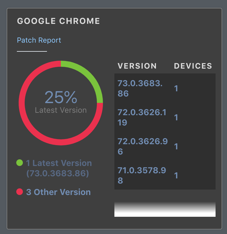
Here is a view of a dashboard item. Smaller area, but you can see the small white fade section at the bottom.
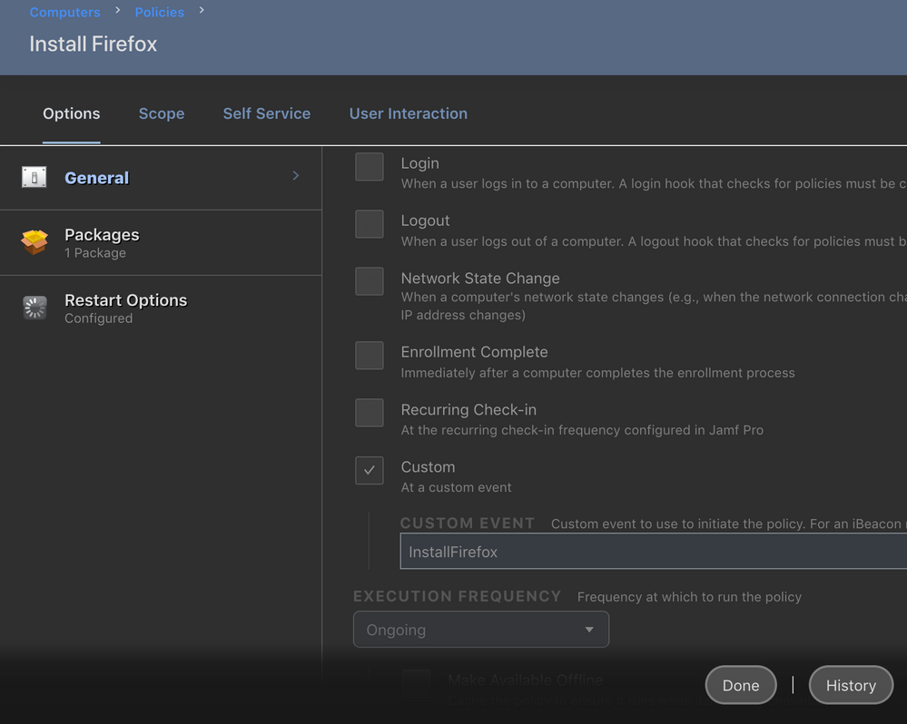
In contrast, here is a view of a policy, which shows the proper fade to black section at the bottom.
You did mention that the fading parts were tricky to locate and modify, or that there were a lot of style elements associated with those. I suspect there are a few pieces that slipped through that still need to be adjusted so they don't show up with the white fade.
Hope the above helps.
Edit: Forgot to mention it, but in case it wasn't obvious, the dashboard item above is a patch title, not a policy. Interestingly, regular policies don't have the fade area, so it doesn't show up on those.
- Mark as New
- Bookmark
- Subscribe
- Mute
- Subscribe to RSS Feed
- Permalink
- Report Inappropriate Content
Posted on 04-02-2019 01:25 PM
@mm2270 : Strange. I don't see it there, but I did find it elsewhere:
User-Initiated Enrollment > Messaging.
I see exactly what the problem is, will update in Github and Stylish.
First is a a class called '.jamf-standard-buttons' and the offending line is the background: linear-gradient.
.jamf-standard-buttons
{
    background: linear-gradient(to bottom,rgba(255,255,255,0) 0,rgba(255,255,255,0.75) 25%,rgba(255,255,255,0.95) 50%);
    position: fixed;
    display: flex;
    -webkit-box-align: start;
    -ms-flex-align: start;
    align-items: flex-start;
    -ms-flex-wrap: wrap;
    flex-wrap: wrap;
    bottom: 0;
    right: 0;
    left: 0;
    z-index: 1;
    padding: 21px;
}
The second part, the table with the white highlight, is part of the .jamf-table-theme class. Backround is #fff (white) and text color is #666 (medium gray). My defaults are #3f3f3f (dark gray) and #dddddd (near white).
I also discovered that I had a duplicate reference to '.jamf-table-theme.' My bad!
.jamf-table-theme
{
    background-color: #fff;
    color: #666;
    font: 400 14px ProximaNova,"Helvetica Nueu",Verdana,sans-serif;
}
Incidentally, the spelling of "Helvetica Nueu" is incorrect and it's all over the CSS. :-( I left it alone because it doesn't affect my modifications.
- Mark as New
- Bookmark
- Subscribe
- Mute
- Subscribe to RSS Feed
- Permalink
- Report Inappropriate Content
Posted on 04-03-2019 05:50 AM
@bradtchapman Done a bit of digging and looks like the Patch Policy Dashboard items are using
.jamf-patch-summary.is-on-dashboard .jamf-inner-list::after
{
     background: -webkit-gradient(linear,left top,left bottom,from(rgba(255,255,255,0)),color-stop(75%,#fff),to(#fff));
     background: linear-gradient(to bottom,rgba(255,255,255,0) 0,#fff 75%,#fff 100%);
     bottom: 0;
     content: "";
     height: 25px;
     left: 0;
     position: absolute;
     width: 100%;
}
I did a live edit in the Chrome dev tools replacing #fff with #2f2f2f in 'background: linear-gradient' and everything looks like it should on the fade.
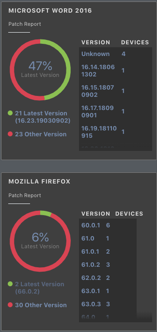
There is a little display inconsistency in the Patch Policy items which can be seen in the screenshot below - it (on my dashboard at least) seems to manifest where all the version numbers are < 8 chars (i.e. Firefox)...as soon as you have have something longer (i.e. Microsoft Word) where we also have 'Unknown' listed (7 chars) then the background covers the full width.
I've not worked that one out yet but it could be unrelated to the CSS as the white background would have masked this.
- Mark as New
- Bookmark
- Subscribe
- Mute
- Subscribe to RSS Feed
- Permalink
- Report Inappropriate Content
Posted on 04-03-2019 07:39 AM
I found another funny stylesheet definition: ".jumbotron" - it's the /enroll screen.
- Mark as New
- Bookmark
- Subscribe
- Mute
- Subscribe to RSS Feed
- Permalink
- Report Inappropriate Content
Posted on 04-03-2019 08:19 AM
Things are looking more unified with each little addition. I included @jsherwood's edit above and that more or less takes care of the patch dashboard items, though it seems the text showing the version breakdown in those exists in it's own dark panel that makes it look a little odd under certain circumstances. No biggie though.
But I did see this. On the Scripts page and the Buildings page (both of which use a table view) there is an odd rollover anomaly. Take a look at these screenshots. The lighter grey rows, when moused over, highlight to a dark blue, which is good.
But the darker grey rows, when moused over, look like this:
They turn almost completely white, but the text in the category and priority columns is still a light grey, so it almost completely disappears. I'm guessing something got missed in whatever controls that and the highlight should also turn dark blue or a dark grey or something else other than white.
If I find what's causing that, I'll post back with any info.
Edit: Well, I see the section in the style sheet that controls the table options (.jamf-table-theme) and the .ag-row-hover, which is already set to highlight to color background-color: #268aff; is there, but for some reason it only applies to the even rows, not odd. As for that, it depends on how you view it. It looks like Jamf Pro considers the header to be row 1, so an odd row, and then goes from there. So the first row under the header (row 2) highlights properly, and then the next row (3) does not, and so on.
It's been years since I even played around a little with CSS and style sheets, and even then I only ever knew a little of it, so I'm lost in what needs to be edited to fix that issue. It's possible it may not even be fixable I suppose.
- Mark as New
- Bookmark
- Subscribe
- Mute
- Subscribe to RSS Feed
- Permalink
- Report Inappropriate Content
Posted on 04-03-2019 09:31 AM
@bradtchapman @mm2270 A couple more tweaks:
.jamf-patch-summary.is-on-dashboard .jamf-inner-list thead, .jamf-patch-summary.is-on-dashboard .jamf-inner-list tbody {
    display: block;
    background: #2f2f2f;
}
This seems to cure the variable border I mentioned earlier
.jamf-patch-summary .jamf-inner-list thead th, .jamf-patch-summary .jamf-inner-list tbody tr:nth-child(odd), .jamf-patch-summary .jamf-inner-list tbody tr:nth-child(even) {
    background: #3f3f3f;
    width: 92px;
}
This widens the Version/Device header to fill the newly darkened background
- Mark as New
- Bookmark
- Subscribe
- Mute
- Subscribe to RSS Feed
- Permalink
- Report Inappropriate Content
Posted on 04-03-2019 10:52 AM
@bradtchapman this is awesome! Thank you for sharing!
- Mark as New
- Bookmark
- Subscribe
- Mute
- Subscribe to RSS Feed
- Permalink
- Report Inappropriate Content
Posted on 04-03-2019 12:55 PM
If I update from Stylish do I get these tweaks?
- Mark as New
- Bookmark
- Subscribe
- Mute
- Subscribe to RSS Feed
- Permalink
- Report Inappropriate Content
Posted on 04-03-2019 04:04 PM
@m.donovan yes!
I haven’t implemented all of the fixes just yet, though, but check back soon.
- Mark as New
- Bookmark
- Subscribe
- Mute
- Subscribe to RSS Feed
- Permalink
- Report Inappropriate Content
Posted on 04-04-2019 10:06 AM
Love everything about this so far, solid work!
If anyone can be sure to up-vote the feature request and maybe the good ol'e Jamf admins will give us the gift of dark mode!
https://www.jamf.com/jamf-nation/feature-requests/8380/dark-mode-for-the-jamf-pro-web-admin-panel
- Mark as New
- Bookmark
- Subscribe
- Mute
- Subscribe to RSS Feed
- Permalink
- Report Inappropriate Content
Posted on 04-04-2019 12:28 PM
@jsherwood : the reason for the inconsistency is that I had a background gradient to RGBA(24,24,24,0). I picked it arbitrarily as I was hacking away at this stylesheet. That turned out to be too dark to match #3f3f3f, it looked ugly on all the screens with buttons, so I raised the color to RGBA(47,47,47,0).
I've incorporated the dashboard adjustment into the style sheet on github and stylish. Confirmed it applied correctly by adding a patch management title to the dashboard.
- Mark as New
- Bookmark
- Subscribe
- Mute
- Subscribe to RSS Feed
- Permalink
- Report Inappropriate Content
Posted on 04-05-2019 12:58 PM
Another update: if you ever receive an 'access denied' message, this calls the 'jamf-splash' page elements. I've fixed the colors and updated the style sheet everywhere.
- Mark as New
- Bookmark
- Subscribe
- Mute
- Subscribe to RSS Feed
- Permalink
- Report Inappropriate Content
Posted on 04-11-2019 08:34 AM
@bradtchapman Found another one - the pop-up guides that appear when you click on the little 'i' bubbles (example: when creating a PPPC payload on Configuration Profiles there is one next to IDENTIFIER).
These are presenting as light grey text on a white background - will try and work on it tomorrow, looks like a div class "pendo-guide" (underscore either side, markdown is stripping them out!) along with some variations on the name are involved.
- Mark as New
- Bookmark
- Subscribe
- Mute
- Subscribe to RSS Feed
- Permalink
- Report Inappropriate Content
Posted on 11-18-2019 12:11 PM
Today I updated the Dark Mode theme in two ways:
Reverted back to site default font choices. Although San Francisco font is superior to whatever Jamf is using, this global font change was affecting the Script pane by using proportional font instead of monospace. Reverting will fix this.
Fixed a pale blue hover color in the Patch Management section; the new color is dark blue, to ensure text is still readable when the mouse is hovering over that row. Should help other screens with similar table UI.
Please update your styles. Note: you will need to edit the domain in the Stylish control panel back to your Jamf Pro domain. The default is pretendco.
- Mark as New
- Bookmark
- Subscribe
- Mute
- Subscribe to RSS Feed
- Permalink
- Report Inappropriate Content
Posted on 11-19-2019 03:16 AM
Is there a chance you could make this compatible with Cascadea so we can use it in Safari?
Thank you! :)
- Mark as New
- Bookmark
- Subscribe
- Mute
- Subscribe to RSS Feed
- Permalink
- Report Inappropriate Content
Posted on 11-19-2019 04:17 AM
@bradtchapman That look awesome 👍🏻
I'll definitely pester every jammer I can to get this implemented.
It's really great!
- Mark as New
- Bookmark
- Subscribe
- Mute
- Subscribe to RSS Feed
- Permalink
- Report Inappropriate Content
Posted on 11-19-2019 11:47 AM
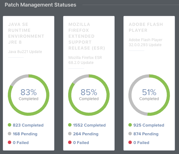
@bradtchapman This style is great. One thing I have found is that on the dashboard Patch Management Statuses boxes are still white.
- Mark as New
- Bookmark
- Subscribe
- Mute
- Subscribe to RSS Feed
- Permalink
- Report Inappropriate Content
Posted on 11-19-2019 03:23 PM
@adam.richardson : sorry but mine doesn’t look like that. Appears fine with a dark background. Are you sure you have the latest version of the theme? Maybe try removing and adding again.
- Mark as New
- Bookmark
- Subscribe
- Mute
- Subscribe to RSS Feed
- Permalink
- Report Inappropriate Content
Posted on 11-20-2019 04:47 AM
@bradtchapman I do have the latest version, although I am using Edge browser. I was able to resolve the issue by adding the following to the code
.chart-widget
{
    background-color: #3f3f3f;
}
I'm definitely not a CSS expert, but it seems to have done the trick, thanks.
- Mark as New
- Bookmark
- Subscribe
- Mute
- Subscribe to RSS Feed
- Permalink
- Report Inappropriate Content
Posted on 11-20-2019 08:18 AM
excellent work @bradtchapman . It works great on jamfcloud as well. A couple of the newer features in Settings don't display dark, Cloud Identity Providers and enrolment customisations but looks ok apart from that. Now if we could turn jamf | nation dark as well :-)
- Mark as New
- Bookmark
- Subscribe
- Mute
- Subscribe to RSS Feed
- Permalink
- Report Inappropriate Content
Posted on 11-20-2019 08:43 AM
@marklamont - thanks. It seems Jamf is using YET ANOTHER NEW STYLE in these areas, instead of reusing existing ones. Our on-prem environment is on 10.15.1 so I won’t be able to check these new areas until I request a beta instance of 10.18.
- Mark as New
- Bookmark
- Subscribe
- Mute
- Subscribe to RSS Feed
- Permalink
- Report Inappropriate Content
Posted on 03-11-2020 06:22 PM
I've just updated my Jamf Pro Dark Mode CSS style sheet to deal with some subtle changes with Jamf Pro 10.19. Github source.
- Mark as New
- Bookmark
- Subscribe
- Mute
- Subscribe to RSS Feed
- Permalink
- Report Inappropriate Content
Posted on 04-22-2022 04:08 PM
Hello, Any updates to this in 2022? Smart Group lists are completely white? Wondering if anyone has updated the CSS?
- Mark as New
- Bookmark
- Subscribe
- Mute
- Subscribe to RSS Feed
- Permalink
- Report Inappropriate Content
Posted on 10-30-2023 06:28 AM
Looks like with the new version of Jamfpro we have a style-breaking new user interface. Jamf Pro 11.0.1
