- Jamf Nation Community
- Products
- Jamf Pro
- Jamf Pro 11.x colors don't match
- Subscribe to RSS Feed
- Mark Topic as New
- Mark Topic as Read
- Float this Topic for Current User
- Bookmark
- Subscribe
- Mute
- Printer Friendly Page
Jamf Pro 11.x colors don't match
- Mark as New
- Bookmark
- Subscribe
- Mute
- Subscribe to RSS Feed
- Permalink
- Report Inappropriate Content
Posted on
11-03-2023
05:32 AM
- last edited
Tuesday
by
![]() kh-richa_mig
kh-richa_mig
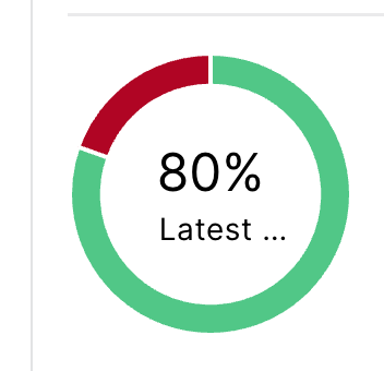
With the rollout of Jamf Pro 11, my cloud tenant updated without issue. However after using the new updates for a few days, I'm becoming slightly annoyed by the change in color palettes. Policy status (the 6% below) are brighter color palettes. The Patch Management Statuses colors are what appear to be the pre-Jamf Pro 11 color palette. It's semantics, I know, but when my dashboard is full of policies and Statuses that I use for at-a-glance updates, it's very noticeable. I know this isn't where you post feedback, but I know Jamf watches the forums.
- Mark as New
- Bookmark
- Subscribe
- Mute
- Subscribe to RSS Feed
- Permalink
- Report Inappropriate Content
Posted on 11-03-2023 06:40 AM
Grey is pending.
- Mark as New
- Bookmark
- Subscribe
- Mute
- Subscribe to RSS Feed
- Permalink
- Report Inappropriate Content
Posted on 11-03-2023 06:44 AM
I have a feeling this was intended, but it bothers me as well. Personally, it blows my mind that JAMF Pro 11 went to production without a dark mode considering how blinding the UI is.
- Mark as New
- Bookmark
- Subscribe
- Mute
- Subscribe to RSS Feed
- Permalink
- Report Inappropriate Content
Posted on 11-07-2023 09:32 AM
I mentioned that to my rep this morning, how it wasn't very "Jamf-y."
They directed me back to the FR: https://ideas.jamf.com/ideas/JN-I-15903

