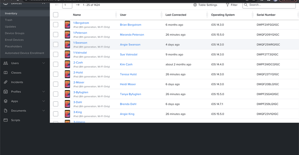
New User Interface and Faster Loading for the Devices Overview in Jamf School
- Mark as New
- Bookmark
- Subscribe
- Mute
- Subscribe to RSS Feed
- Permalink
- Report Inappropriate Content
Posted on 06-02-2022 04:45 AM
- Mark as New
- Bookmark
- Subscribe
- Mute
- Subscribe to RSS Feed
- Permalink
- Report Inappropriate Content
Posted on 06-03-2022 08:41 AM
Looks good!
There appears to be an issue when attempting to export devices. No matter how many devices I select, it will export a list of all devices.
- Mark as New
- Bookmark
- Subscribe
- Mute
- Subscribe to RSS Feed
- Permalink
- Report Inappropriate Content
Posted on 06-09-2022 02:08 AM
Is it possible to get the "records per page" dropdown menu back? Actually its missing in the new table view.
@r_lowe the export behaves in the new ui exactly like in the old. But the filtering of the export is a feature I often missed.
- Mark as New
- Bookmark
- Subscribe
- Mute
- Subscribe to RSS Feed
- Permalink
- Report Inappropriate Content
Posted on 06-09-2022 06:50 AM
Checking out the new appearance led to the discovery of the Recovery Lock addition, which has made me quite happy, but also led me to notice a couple of problems (unrelated).
1) When choosing Select All, it only selects everything on the current page. Previously, using Select All selected everything on all pages, and made bulk commands very easy.
2) The filters are great. Love the options. But I think it would be improve the experience if there was a reset all filters button. Otherwise, you have to fish around for whatever filter(s) you had enabled from before to reset it.
There may be solutions to these issues, but I couldn't find anything intuitive. Overall, works very well, except for doing bulk commands (ironically).
P.S. Encountered a bug when clicking through a couple of dropdowns in the filter. The page moved up, making the commands/filters inaccessible, while the bottom portion became blank space.
- Mark as New
- Bookmark
- Subscribe
- Mute
- Subscribe to RSS Feed
- Permalink
- Report Inappropriate Content
Posted on 07-21-2022 01:36 AM
The new interface is not usable for gathering information.
Except for it being slow as ... (That is one of the main reasons we switched from JAMF Prof to Zuludesk)
Viewing the filter set on the right side is far from intuitive.
Note beging able to see them all at once and no ability to reset all the filters set...
Any changes to the columns and their width do not survive a logout.
Apart from that it is not at all usable on an iPhone sind it does not scroll sideways through the columns.
And again, not to mention the "I will make some coffee" when set to displaying 500 devices.
It has some ideas but this needs to get back to the drawing board.
Just my 2 cts and the urge to get this of of my (my teams) chest.
- Mark as New
- Bookmark
- Subscribe
- Mute
- Subscribe to RSS Feed
- Permalink
- Report Inappropriate Content
Posted on 07-22-2022 11:45 AM
The new interface is cumbersome and unwieldy to use, especially the filters on the inventory tab. Certain bulk options that used to work flawlessly, like Refresh, no longer work.
- Mark as New
- Bookmark
- Subscribe
- Mute
- Subscribe to RSS Feed
- Permalink
- Report Inappropriate Content
Posted on 07-24-2022 08:53 PM
The Inventory option will not show my devices, and only spins no matter how long I wait. I have to switch back to the old interface and use Devices to see them. This has been reproducible under multiple browsers, using Private Browsing sessions, and across multiple devices.
- Mark as New
- Bookmark
- Subscribe
- Mute
- Subscribe to RSS Feed
- Permalink
- Report Inappropriate Content
Posted on 10-06-2022 05:45 AM
Contra New Interface 👎
- the old filter overview on the top was better. Much clearer!
- the filter setting not reseted automatically after switch to the another category
- It being very slow, if you choose more than 250 Device
- To active "Lost Mode" was better in the old interface. You get the Info in the Name, was highlighted and was helpful
Pro New Interface 👍
- Tablett Settings (to choose the own column)
- that possible functions are grayed out (not visible in the old Interface until you select a device. Leads to confusion)
- Mark as New
- Bookmark
- Subscribe
- Mute
- Subscribe to RSS Feed
- Permalink
- Report Inappropriate Content
Posted on 10-06-2022 06:30 AM
Contra New Interface 👎
- the old filter overview on the top was better. Much clearer!
- the filter setting not reseted automatically after switch to the another category
- It being very slow, if you choose more than 250 Device
- To active "Lost Mode" was better in the old interface. You get the Info in the Name, was highlighted and was helpful
Pro New Interface 👍
- Tablett Settings (to choose the own column)
- that possible functions are grayed out (not visible in the old Interface until you select a device. Leads to confusion)
- Mark as New
- Bookmark
- Subscribe
- Mute
- Subscribe to RSS Feed
- Permalink
- Report Inappropriate Content
Posted on 07-05-2024 06:26 AM
Please bring back the old interface, the new interface sucks.
