Show us your Self Service branding
- Mark as New
- Bookmark
- Subscribe
- Mute
- Subscribe to RSS Feed
- Permalink
- Report Inappropriate Content
Posted on
03-02-2018
04:11 AM
- last edited
3 weeks ago
by
![]() kh-richa_mig
kh-richa_mig
I just upgraded to 10.2.1 and I'm drawing a blank for how I can brand our Self Service. I've sent the technical specifications of the icon and banner size to one of our graphic designers but without some samples of what is out there, we're kinda fumbling.
I've had a couple ideas for just boring company logo over a photo of our building. Blah. I've had another idea for a banner image that I can change out with static alerts like holiday hours, company events, special software updates that need users' attention. But I don't know how they would look with the Self Service window at different sizes. Unfortunately JamfPro doesn't give us a sandbox to play around in to preview things. (I'm struggling to get a test server working at the moment)
I know that the text overlay is white so our images have to have proper contrast for it to be seen, but I'd like to see some real-world examples. Let us see what you've got! :-)
- Labels:
-
Self Service
- Mark as New
- Bookmark
- Subscribe
- Mute
- Subscribe to RSS Feed
- Permalink
- Report Inappropriate Content
Posted on 07-01-2020 12:01 PM
- Mark as New
- Bookmark
- Subscribe
- Mute
- Subscribe to RSS Feed
- Permalink
- Report Inappropriate Content
Posted on 04-25-2023 12:37 PM
How did you get the image to go all the way across?
- Mark as New
- Bookmark
- Subscribe
- Mute
- Subscribe to RSS Feed
- Permalink
- Report Inappropriate Content
Posted on 04-25-2023 12:45 PM
Jamf's branding page gives a recommended resolution. You just need to either find or crop a selected image to meet that.
Branding Header
Image to display across the top of Self Service. This will not display in the branding preview.
Recommended 1500x320 pixels and PNG or GIF format- Mark as New
- Bookmark
- Subscribe
- Mute
- Subscribe to RSS Feed
- Permalink
- Report Inappropriate Content
Posted on 07-24-2020 03:35 AM
@bradtchapman It moves, but it's totally acceptable.
- Mark as New
- Bookmark
- Subscribe
- Mute
- Subscribe to RSS Feed
- Permalink
- Report Inappropriate Content
Posted on 07-24-2020 06:33 AM
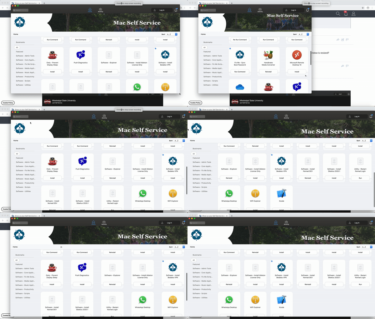
I decided I wanted to play and Photoshop one day and ironically found a very-wide picture of the students that ran in the local paper (website). It made it easy to start with...I then took Bucky the Broncho and made him into an iPhone-shaped icon with smooth edges but not too much. Finally, because our district has a unified mascot for all the schools and "we are one family, one Broncho Nation", I carried that forth and put the more formal LSC Apple IT Support below it for the uninitiated. A part of me wants to put "Software Center for the Mac" like @tblackwell...I refuse on principle though...I've been using Self Service on the Apple side of the house for about 2 years before the Windows side started using Software Center....more users know the name Software Center though at the higher grades because the higher grades tend to be Windows deployments. Also, yes we spell Broncho here with an 'h' due to a funny mistake that occurred back in the early 1900s.
- Mark as New
- Bookmark
- Subscribe
- Mute
- Subscribe to RSS Feed
- Permalink
- Report Inappropriate Content
Posted on 02-19-2021 06:38 PM
it'd be better if gifs worked
- Mark as New
- Bookmark
- Subscribe
- Mute
- Subscribe to RSS Feed
- Permalink
- Report Inappropriate Content
Posted on 02-23-2021 01:22 AM
I really dislike the new look of Self Service. How we please revert it?
- Mark as New
- Bookmark
- Subscribe
- Mute
- Subscribe to RSS Feed
- Permalink
- Report Inappropriate Content
Posted on 02-23-2021 02:36 AM
This will be known as the Self Service dark times... where nobody wants to show off their branding now its all changed for the worse with 10.27
- Mark as New
- Bookmark
- Subscribe
- Mute
- Subscribe to RSS Feed
- Permalink
- Report Inappropriate Content
Posted on 02-23-2021 07:09 AM
what is the size of the banner for the Branding Header"use a GIF or PNG file that is 1500x500 pixels." but my image looks terrible.
- Mark as New
- Bookmark
- Subscribe
- Mute
- Subscribe to RSS Feed
- Permalink
- Report Inappropriate Content
Posted on 02-23-2021 07:30 AM
This will be known as the Self Service dark times... where nobody wants to show off their branding now its all changed for the worse with 10.27
This is exactly why you don't test in production...
- Mark as New
- Bookmark
- Subscribe
- Mute
- Subscribe to RSS Feed
- Permalink
- Report Inappropriate Content
Posted on 02-23-2021 08:30 AM
At the moment, as long as Self Service still works, I'm not too bent out of shape over the re-design. I don't quite see the advantage of it over the legacy version, since most of the main content (aka buttons to click) still look the same. Just that a) the header image doesn't fit, and b) the sidebar looks more "Finder" than it did before. Sure. Ok.
There was a time in the early/mid 2010's where Jamf kept putting out upgrades that just. did. not. work. At least we aren't having that problem with self service.
- Mark as New
- Bookmark
- Subscribe
- Mute
- Subscribe to RSS Feed
- Permalink
- Report Inappropriate Content
Posted on 02-23-2021 08:49 AM
- Mark as New
- Bookmark
- Subscribe
- Mute
- Subscribe to RSS Feed
- Permalink
- Report Inappropriate Content
Posted on 02-23-2021 11:43 AM
I have a series of photographs that I prep for this, as well as the desktop backgrounds for people to choose.
- Mark as New
- Bookmark
- Subscribe
- Mute
- Subscribe to RSS Feed
- Permalink
- Report Inappropriate Content
Posted on 02-23-2021 12:46 PM
With 10.27 the branding image doesn't 'resize' like I'd expect. instead it gets all distorted. :(
Also, I've lost my categories on the side! GAH!!!
- Mark as New
- Bookmark
- Subscribe
- Mute
- Subscribe to RSS Feed
- Permalink
- Report Inappropriate Content
Posted on 02-23-2021 01:26 PM
No matter how much resizing I've applied to the original image in Preview I can't seem to get our banner to look presentable in Self Service 10.27. Sad to say we've simply removed our banner for now... See ya later, Zenyatta :(
- Mark as New
- Bookmark
- Subscribe
- Mute
- Subscribe to RSS Feed
- Permalink
- Report Inappropriate Content
Posted on 02-23-2021 01:29 PM
Pre-10.27 and with 10.27. Major issues with the space allocated for Company name (which violates our branding standards), banner image re-sizing, etc.
Oh and Categories... Not there... Unless I click in the blank space located between the Search field and the Notification, at which point a Browse pull down appears with the categories.
So yeah, lots of stuff to not like.
- Mark as New
- Bookmark
- Subscribe
- Mute
- Subscribe to RSS Feed
- Permalink
- Report Inappropriate Content
Posted on 02-23-2021 01:30 PM
https://www.jamf.com/jamf-nation/feature-requests/10177/revert-self-service-s-design-to-the-10-26-version
Please vote!
- Mark as New
- Bookmark
- Subscribe
- Mute
- Subscribe to RSS Feed
- Permalink
- Report Inappropriate Content
Posted on 02-23-2021 02:15 PM
It has totally messed up the branding and it looks terrible now.
- Mark as New
- Bookmark
- Subscribe
- Mute
- Subscribe to RSS Feed
- Permalink
- Report Inappropriate Content
Posted on 02-25-2021 07:11 AM
I adapted to the new format by replacing our branding header image with one that emphasizes text, rather than a photo. That way it works at any level of stretching. I also tightened the kerning by 25% on the text of my base image, to make it look better on our widescreen monitors.
- Mark as New
- Bookmark
- Subscribe
- Mute
- Subscribe to RSS Feed
- Permalink
- Report Inappropriate Content
Posted on 03-10-2021 02:56 PM
This change was brought to my attention by a user, which is embarrassing. Especially when you're a creative company full of people that scrutinize these things.
It does seem odd that Jamf is a company focused on Apple products but seems to be incapable of following Apple's UI design guidelines. Nothing looks or acts very Apple-like, so I'm not surprised by this, but I wish I didn't have to do damage control.
- Mark as New
- Bookmark
- Subscribe
- Mute
- Subscribe to RSS Feed
- Permalink
- Report Inappropriate Content
Posted on 03-10-2021 04:46 PM
I can't imagine who at Jamf thought this was a good change. If people go to this much trouble to make Self Service look good, Jamf should not be undoing all their hard work.
- Mark as New
- Bookmark
- Subscribe
- Mute
- Subscribe to RSS Feed
- Permalink
- Report Inappropriate Content
Posted on 03-11-2021 02:39 PM
Old vs new... Thank you JAMF for helping our department garner respect through design. #blatantsarcasm
- Mark as New
- Bookmark
- Subscribe
- Mute
- Subscribe to RSS Feed
- Permalink
- Report Inappropriate Content
Posted on 03-16-2021 01:10 PM
As of Jamf 10.27 the recommended header size is now 335 x 1000.
- Mark as New
- Bookmark
- Subscribe
- Mute
- Subscribe to RSS Feed
- Permalink
- Report Inappropriate Content
Posted on 11-08-2021 07:02 AM
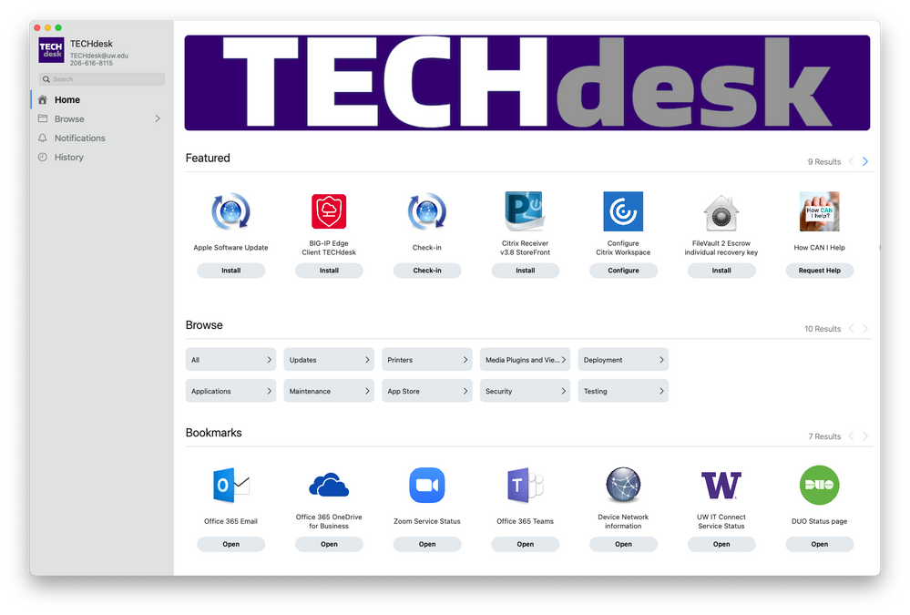
Here is our's, i had to change the pixel size to get it to size right. It wouldn't look right with 1000x335. Had a designer here at VW help me get something dialed in right. I'm happy how it came out.
- Mark as New
- Bookmark
- Subscribe
- Mute
- Subscribe to RSS Feed
- Permalink
- Report Inappropriate Content
Posted on 11-08-2021 07:27 AM
Last year I felt bad/lazy for not having a banner and just using our university logo/name, but now I feel like I dodged a bullet. What I was considering picking would not have looked good by itself in the redesigned Self Service.
- Mark as New
- Bookmark
- Subscribe
- Mute
- Subscribe to RSS Feed
- Permalink
- Report Inappropriate Content
Posted on 11-08-2021 09:11 AM
Here is ours, this go around of Self Service Branding;
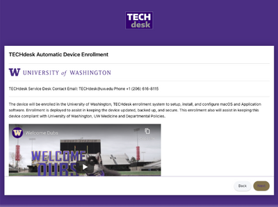
I also added Prestage enrollment customization.
- Mark as New
- Bookmark
- Subscribe
- Mute
- Subscribe to RSS Feed
- Permalink
- Report Inappropriate Content
Posted on 10-26-2023 02:26 PM
The greatest shame is that one cannot use animated gifs for the banner!!!!!


