- Jamf Nation Community
- Products
- Jamf Pro
- Re: Show us your Self Service branding
- Subscribe to RSS Feed
- Mark Topic as New
- Mark Topic as Read
- Float this Topic for Current User
- Bookmark
- Subscribe
- Mute
- Printer Friendly Page
Show us your Self Service branding
- Mark as New
- Bookmark
- Subscribe
- Mute
- Subscribe to RSS Feed
- Permalink
- Report Inappropriate Content
Posted on
03-02-2018
04:11 AM
- last edited
2 weeks ago
by
![]() kh-richa_mig
kh-richa_mig
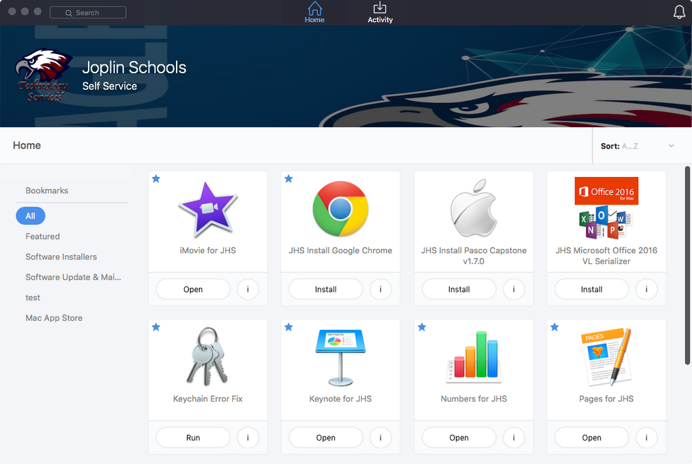
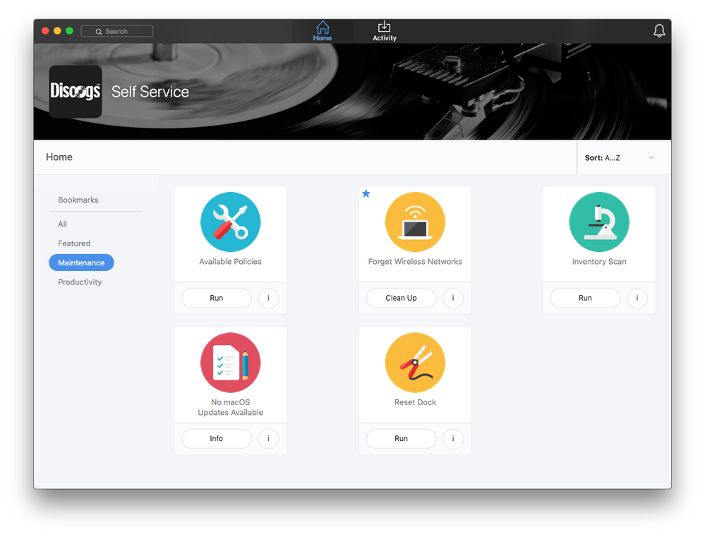
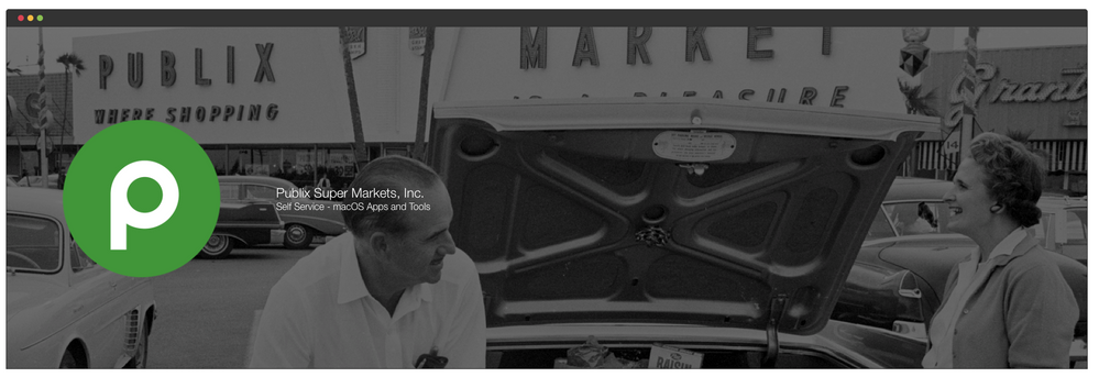
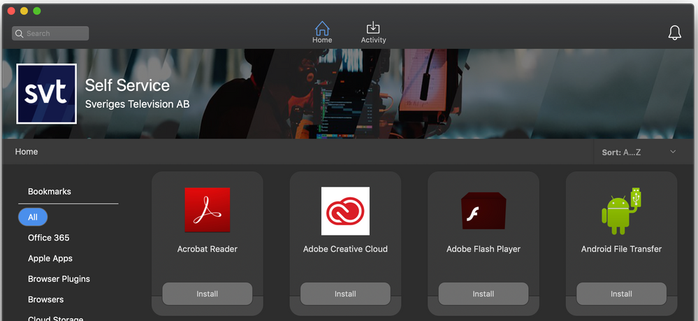
I just upgraded to 10.2.1 and I'm drawing a blank for how I can brand our Self Service. I've sent the technical specifications of the icon and banner size to one of our graphic designers but without some samples of what is out there, we're kinda fumbling.
I've had a couple ideas for just boring company logo over a photo of our building. Blah. I've had another idea for a banner image that I can change out with static alerts like holiday hours, company events, special software updates that need users' attention. But I don't know how they would look with the Self Service window at different sizes. Unfortunately JamfPro doesn't give us a sandbox to play around in to preview things. (I'm struggling to get a test server working at the moment)
I know that the text overlay is white so our images have to have proper contrast for it to be seen, but I'd like to see some real-world examples. Let us see what you've got! :-)
- Labels:
-
Self Service
- Mark as New
- Bookmark
- Subscribe
- Mute
- Subscribe to RSS Feed
- Permalink
- Report Inappropriate Content
Posted on 09-10-2018 11:50 AM
- Mark as New
- Bookmark
- Subscribe
- Mute
- Subscribe to RSS Feed
- Permalink
- Report Inappropriate Content
Posted on 09-10-2018 02:32 PM
- Mark as New
- Bookmark
- Subscribe
- Mute
- Subscribe to RSS Feed
- Permalink
- Report Inappropriate Content
Posted on 09-10-2018 03:25 PM
- Mark as New
- Bookmark
- Subscribe
- Mute
- Subscribe to RSS Feed
- Permalink
- Report Inappropriate Content
Posted on 09-11-2018 04:09 AM
Looking at these I realized that if your company makes a Mac app and that dock is probably in most of your employee's Docks and that app's icon is a major part of your company's identity, you may want to slightly modify it before making it your Self Service icon. That way you don't have 2 of the same icon in the Dock confusing users.
- Mark as New
- Bookmark
- Subscribe
- Mute
- Subscribe to RSS Feed
- Permalink
- Report Inappropriate Content
Posted on 09-13-2018 04:44 PM
@matin.logmein How'd you get the banner area so tall? I thought it was limited to 1500 x 500px?
- Mark as New
- Bookmark
- Subscribe
- Mute
- Subscribe to RSS Feed
- Permalink
- Report Inappropriate Content
Posted on 09-13-2018 04:47 PM
We try not to make it obvious what company our laptop belongs too since it can lead to the user literally being targeted by unfriendly governments or 'impolite' (ie. ISIS, etc) groups. So, the only obvious company branding is the small property tag on the bottom and it's one of our parent companies. But, if you look real close...
- Mark as New
- Bookmark
- Subscribe
- Mute
- Subscribe to RSS Feed
- Permalink
- Report Inappropriate Content
Posted on 09-13-2018 04:52 PM
I'm hoping the Feature Request for more customization allows us to have a collection of images we can rotate through. We've got a ton of great images we could rotate through. I'd even be happy with an API...
- Mark as New
- Bookmark
- Subscribe
- Mute
- Subscribe to RSS Feed
- Permalink
- Report Inappropriate Content
Posted on 09-13-2018 05:29 PM
- Mark as New
- Bookmark
- Subscribe
- Mute
- Subscribe to RSS Feed
- Permalink
- Report Inappropriate Content
Posted on 09-13-2018 10:08 PM
- Mark as New
- Bookmark
- Subscribe
- Mute
- Subscribe to RSS Feed
- Permalink
- Report Inappropriate Content
Posted on 09-13-2018 10:24 PM
- Mark as New
- Bookmark
- Subscribe
- Mute
- Subscribe to RSS Feed
- Permalink
- Report Inappropriate Content
Posted on 09-14-2018 06:28 AM
- Mark as New
- Bookmark
- Subscribe
- Mute
- Subscribe to RSS Feed
- Permalink
- Report Inappropriate Content
Posted on 09-14-2018 07:59 AM
- Mark as New
- Bookmark
- Subscribe
- Mute
- Subscribe to RSS Feed
- Permalink
- Report Inappropriate Content
Posted on 09-14-2018 09:59 AM
- Mark as New
- Bookmark
- Subscribe
- Mute
- Subscribe to RSS Feed
- Permalink
- Report Inappropriate Content
Posted on 09-17-2018 01:47 PM
Go bulldogs!
- Mark as New
- Bookmark
- Subscribe
- Mute
- Subscribe to RSS Feed
- Permalink
- Report Inappropriate Content
Posted on 10-12-2018 10:37 AM
Move Mountains
- Mark as New
- Bookmark
- Subscribe
- Mute
- Subscribe to RSS Feed
- Permalink
- Report Inappropriate Content
Posted on 10-12-2018 10:59 AM
I really like the branding options in version 10!
- Mark as New
- Bookmark
- Subscribe
- Mute
- Subscribe to RSS Feed
- Permalink
- Report Inappropriate Content
Posted on 10-16-2018 12:22 PM
Late to the party, but here is ours!!.
- Mark as New
- Bookmark
- Subscribe
- Mute
- Subscribe to RSS Feed
- Permalink
- Report Inappropriate Content
Posted on 10-16-2018 01:00 PM
- Mark as New
- Bookmark
- Subscribe
- Mute
- Subscribe to RSS Feed
- Permalink
- Report Inappropriate Content
Posted on 10-16-2018 03:03 PM
- Mark as New
- Bookmark
- Subscribe
- Mute
- Subscribe to RSS Feed
- Permalink
- Report Inappropriate Content
Posted on 10-17-2018 11:33 AM
- Mark as New
- Bookmark
- Subscribe
- Mute
- Subscribe to RSS Feed
- Permalink
- Report Inappropriate Content
Posted on 10-18-2018 07:10 PM
- Mark as New
- Bookmark
- Subscribe
- Mute
- Subscribe to RSS Feed
- Permalink
- Report Inappropriate Content
Posted on 10-18-2018 08:53 PM
- Mark as New
- Bookmark
- Subscribe
- Mute
- Subscribe to RSS Feed
- Permalink
- Report Inappropriate Content
Posted on 03-22-2019 05:26 PM
- Mark as New
- Bookmark
- Subscribe
- Mute
- Subscribe to RSS Feed
- Permalink
- Report Inappropriate Content
Posted on 03-23-2019 01:59 AM
- Mark as New
- Bookmark
- Subscribe
- Mute
- Subscribe to RSS Feed
- Permalink
- Report Inappropriate Content
Posted on 03-23-2019 02:10 AM
- Mark as New
- Bookmark
- Subscribe
- Mute
- Subscribe to RSS Feed
- Permalink
- Report Inappropriate Content
Posted on 03-23-2019 05:42 AM
- Mark as New
- Bookmark
- Subscribe
- Mute
- Subscribe to RSS Feed
- Permalink
- Report Inappropriate Content
Posted on 04-02-2019 11:33 PM
Spring theme.
- Mark as New
- Bookmark
- Subscribe
- Mute
- Subscribe to RSS Feed
- Permalink
- Report Inappropriate Content
Posted on 04-03-2019 03:10 PM
- Mark as New
- Bookmark
- Subscribe
- Mute
- Subscribe to RSS Feed
- Permalink
- Report Inappropriate Content
Posted on 04-04-2019 04:35 AM
- Mark as New
- Bookmark
- Subscribe
- Mute
- Subscribe to RSS Feed
- Permalink
- Report Inappropriate Content
Posted on 04-04-2019 01:44 PM
- Mark as New
- Bookmark
- Subscribe
- Mute
- Subscribe to RSS Feed
- Permalink
- Report Inappropriate Content
Posted on 04-04-2019 04:40 PM
- Mark as New
- Bookmark
- Subscribe
- Mute
- Subscribe to RSS Feed
- Permalink
- Report Inappropriate Content
Posted on 04-05-2019 01:09 AM
- Mark as New
- Bookmark
- Subscribe
- Mute
- Subscribe to RSS Feed
- Permalink
- Report Inappropriate Content
Posted on 04-05-2019 09:51 AM
These are awesome I'm jealous.
- Mark as New
- Bookmark
- Subscribe
- Mute
- Subscribe to RSS Feed
- Permalink
- Report Inappropriate Content
Posted on 04-05-2019 10:10 AM
- Mark as New
- Bookmark
- Subscribe
- Mute
- Subscribe to RSS Feed
- Permalink
- Report Inappropriate Content
Posted on 04-08-2019 06:41 AM
- Mark as New
- Bookmark
- Subscribe
- Mute
- Subscribe to RSS Feed
- Permalink
- Report Inappropriate Content
Posted on 05-13-2019 05:52 PM
@mfurman @jarrod321 @matin.logmein @jimderlatka
Your banners seem enlarged compared to most, is there specific formatting for the enlarged look or am I just crazy?
- Mark as New
- Bookmark
- Subscribe
- Mute
- Subscribe to RSS Feed
- Permalink
- Report Inappropriate Content
Posted on 06-13-2019 01:39 AM
@cwilsonncaa their screenshots are taken from within the server settings where you get a preview of the branding. The preview is a lot bigger than how the real Self Service looks.
- Mark as New
- Bookmark
- Subscribe
- Mute
- Subscribe to RSS Feed
- Permalink
- Report Inappropriate Content
Posted on 06-13-2019 03:33 AM
- Mark as New
- Bookmark
- Subscribe
- Mute
- Subscribe to RSS Feed
- Permalink
- Report Inappropriate Content
Posted on 06-13-2019 11:37 AM
- Mark as New
- Bookmark
- Subscribe
- Mute
- Subscribe to RSS Feed
- Permalink
- Report Inappropriate Content
Posted on 06-20-2019 04:18 AM
@burdett Go Dawgs!


